| Author | Thread |
|
|
01/31/2008 11:45:36 AM |
|
|
|
12/27/2007 03:46:50 AM |
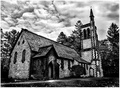
| I like how that shadow splits the frame. |
|
Comments Made During the Challenge  |
|
|
11/18/2007 09:47:25 PM |
| I like this one a lot..... |
|
|
|
11/18/2007 11:44:29 AM |
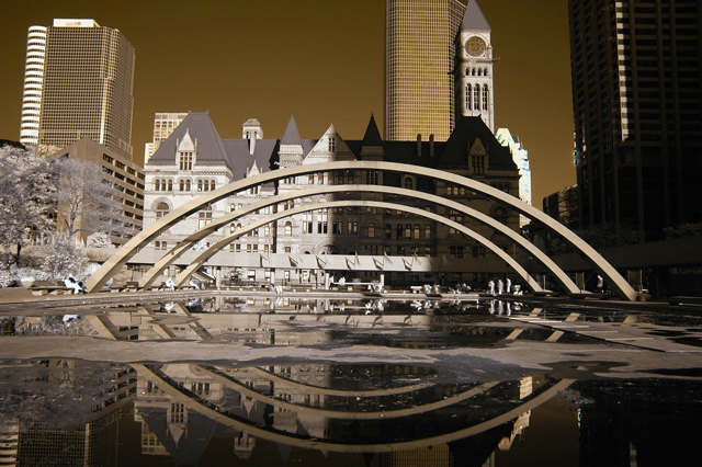
| too bad there is a shadow; it's an interesting shot |
|
|
|
11/17/2007 09:39:27 PM |
| I like the tone but the shadows on the building to the right seems to make this an unbalanced photo. |
|
|
|
11/17/2007 11:15:10 AM |
| Beautiful! To be extremely picky, the only thing that might make this better is to not have cut the top of the clock tower off. 8 |
|
|
|
11/17/2007 04:27:43 AM |
| Excellent composition and timing for the shadows on the far building. |
|
|
|
11/16/2007 02:15:34 PM |
FINALLY someone actually did a duotone... 8 .. way to go.
p.s. - straighen your horizon |
|
|
|
11/15/2007 08:29:00 PM |
|
|
|
11/15/2007 03:45:52 PM |
| I like the "graphic-ness" this shot has. Also, interesting choice of color. |
|
|
|
11/14/2007 03:36:37 PM |
| Very nice use of duo tone. I just wish the arches didn't block the view of that very interesting gray building. The arches and their reflections are framing a section of the scene that is busy and uninteresting. 7 |
|
|
|
11/14/2007 03:16:11 PM |
| Interesting hue choices. With the lighting and grid like windows in the buildings it almost looks like a computer generated wireframe artists impression of an inner city regeneration proposal. Great reflections too. A slight ccw rotation to square up the central building a bit would have made it spot on for me |
|
|
|
11/14/2007 01:54:53 AM |
| I thiiiink this one borderlines on dnmc. I don't really know. Seems like the greys and golds together cross the line. I know i'm probably wrong about this so just in case I'll not consider it. I like the image alot and i love the reflections and clarity of the buildings. 8 |
|
|
|
11/13/2007 12:05:11 AM |
| Beautiful place and reflection, but that shadow that divides the image in almost exactly two halves doesn't work for me. |
|
|
|
11/12/2007 10:39:52 PM |
| Wow!!! This is just really bizarre!!!! Great light, shadows, composition, perpective, detail, reflection.......8 |
|
|
|
11/12/2007 08:21:20 PM |
| not a fan of the cool greys on the buildings opposed to the warm yellow-brown in the sky... i think it would have been better having all grey or all warm tones. |
|
|
|
11/12/2007 01:40:43 PM |
Nathan Phillips skating rink, I wonder how many Torontonians will recognize this without City Hall as the backdrop.
I think it needed another 10% CCW rotation, though. I really like the terminating shadow you've captured. |
|
Home -
Challenges -
Community -
League -
Photos -
Cameras -
Lenses -
Learn -
Prints! -
Help -
Terms of Use -
Privacy -
Top ^
DPChallenge, and website content and design, Copyright © 2001-2024 Challenging Technologies, LLC.
All digital photo copyrights belong to the photographers and may not be used without permission.
Current Server Time: 04/19/2024 04:47:53 PM EDT.