| Author | Thread |
Comments Made During the Challenge  |
|
|
11/27/2007 11:07:19 PM |
| Not a bad composition and the lighting is nice. |
|
 Photographer found comment helpful. Photographer found comment helpful. |
|
|
11/26/2007 06:33:16 PM |
| nice image, somewhat cliche' |
|
| Photographer found comment helpful. |
|
|
11/22/2007 11:18:23 AM |
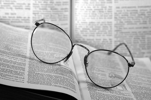
| Now if the rear book had been in focus through the top half of the lenses and the closer book in focus through the bottom this could have been soooo much more interesting |
|
| Photographer found comment helpful. |
|
|
11/22/2007 06:15:19 AM |
Technicals: 1.5/2 - good focus and DOF, light is a bit flat, text in front looks oversharp
Composition: 1/2 - too centered; tilt of the book adds drama, but otherwise makes little sense, dark corner distracts
Challenge Relation: 1.5/2 - topic implies a person to be in the image, the hint is not enough IMO
Originality/Creativity: 1/2
Overall Impact: 1/2
6 |
|
| Photographer found comment helpful. |
|
|
11/21/2007 02:27:31 PM |
| good setup and composition. i like it that it is tilted slightly |
|
| Photographer found comment helpful. |
|
|
11/21/2007 10:36:48 AM |
| Don't like the book in the background...I think it would be better with a dark background or just the table. |
|
| Photographer found comment helpful. |
|
|
11/21/2007 05:02:04 AM |
| great stock image, good bw conversion, like the smooth oof area. though setup and subject are overdone |
|
| Photographer found comment helpful. |
Home -
Challenges -
Community -
League -
Photos -
Cameras -
Lenses -
Learn -
Prints! -
Help -
Terms of Use -
Privacy -
Top ^
DPChallenge, and website content and design, Copyright © 2001-2024 Challenging Technologies, LLC.
All digital photo copyrights belong to the photographers and may not be used without permission.
Current Server Time: 04/27/2024 11:19:02 AM EDT.