| Author | Thread |
|
|
03/25/2008 04:41:46 PM |
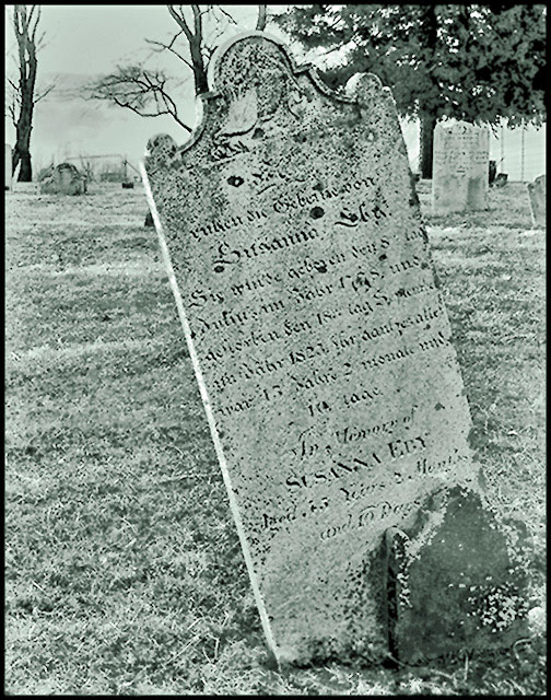
| Very interesting shot. I love the idea, and I like the processing right up to the point where it gets a greenish tinge to it. If it was a straight greyscale it would work better for me. I like the uniqueness of it. |
|
 Photographer found comment helpful. Photographer found comment helpful. |
Comments Made During the Challenge  |
|
|
03/11/2008 05:06:49 PM |
| I am not sure the color tone is the right choice here. Think simple high contrast B&W would have had more impact. Also � likely because of challenge size limit � it is a bit difficult to make out the name on the headstone. |
|
| Photographer found comment helpful. |
|
|
03/10/2008 09:52:21 AM |
| Very nice. The effect on the photo makes it have an old feel to it. |
|
| Photographer found comment helpful. |
|
|
03/09/2008 06:25:58 AM |
Over processed, I think that you have taken the curves slightly too far in this shot, and that combined with your black and white conversion the shot is left looking slightly blown out and unnatural.
-I just thought I'd expand slightly, I know how annoying it is when you get a two word comment. |
|
| Photographer found comment helpful. |
|
|
03/07/2008 05:15:12 PM |
| nice coloring - a little more contrast makes it really cool - maybe deeper blacks - 7 |
|
| Photographer found comment helpful. |
|
|
03/07/2008 03:34:37 PM |
| Nice effort. Just seems slightly out of focus. |
|
| Photographer found comment helpful. |
|
|
03/07/2008 09:36:08 AM |
| I like the photo just dont really care for the color of the whole thing. |
|
| Photographer found comment helpful. |
|
|
03/07/2008 09:25:19 AM |
| i'm not sure if you did this on purpose or not, but the dullness, and somewhat out of focus along with the color tone give this photo classic look. It looks great. 10 |
|
| Photographer found comment helpful. |
|
|
03/06/2008 10:12:15 AM |
| ood shot would of been better if camera was tilted the other driection |
|
| Photographer found comment helpful. |
|
|
03/05/2008 03:49:18 PM |
| I like the content but image quality seems poor. I find myself straining to see any detail. Nice toning. |
|
| Photographer found comment helpful. |
|
|
03/05/2008 02:57:11 PM |
| I like the treatment on this one |
|
| Photographer found comment helpful. |
|
|
03/05/2008 07:32:49 AM |
I like the processing you've given this, but I think you would have had a better fit for the challenge (and a higher score) if you had rotated the camera to make the gravestone vertical.
|
|
| Photographer found comment helpful. |
Home -
Challenges -
Community -
League -
Photos -
Cameras -
Lenses -
Learn -
Prints! -
Help -
Terms of Use -
Privacy -
Top ^
DPChallenge, and website content and design, Copyright © 2001-2024 Challenging Technologies, LLC.
All digital photo copyrights belong to the photographers and may not be used without permission.
Current Server Time: 04/26/2024 05:23:38 AM EDT.