| Author | Thread |
Comments Made During the Challenge  |
|
|
03/18/2008 05:19:32 PM |
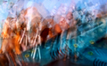
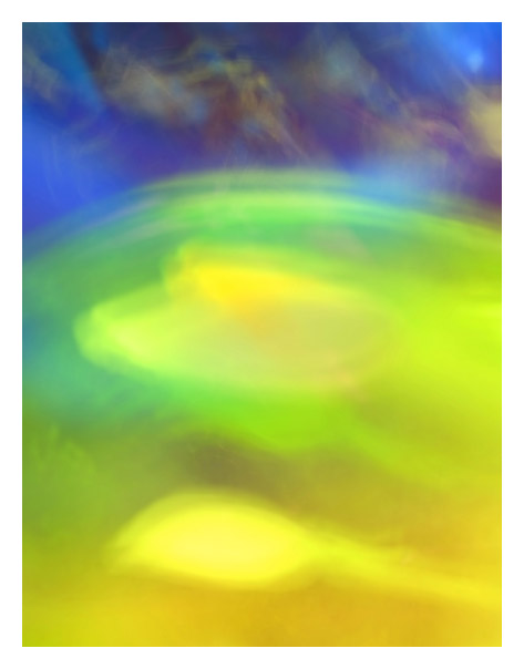
| I have no idea what this is. What I do know is that it is a beautiful abstract. |
|
|
|
03/17/2008 10:30:21 AM |
| Quite abstract, but very well balanced. I feel painting brushes on it. |
|
 Photographer found comment helpful. Photographer found comment helpful. |
|
|
03/16/2008 10:26:17 AM |
| Greatly blurred mess. And the colors are nice too. 9 |
|
| Photographer found comment helpful. |
|
|
03/15/2008 10:35:33 PM |
| Nice glowing colors, but no real focal point. |
|
| Photographer found comment helpful. |
|
|
03/15/2008 09:23:55 PM |
| well done nicely blurred mess |
|
| Photographer found comment helpful. |
|
|
03/15/2008 09:10:10 PM |
| yes, good and blurry too, nice colours. |
|
| Photographer found comment helpful. |
|
|
03/13/2008 01:52:35 PM |
| Most certainly a blurry mess of.... whatever it is. Very loud. I like it. Excuse me while I go pick up my eyes and put them back in their sockets. |
|
| Photographer found comment helpful. |
|
|
03/13/2008 12:29:08 PM |
| great choice to go for complimentary colors. Your picture create a good tension between the cheerful yellow/green tones and the dark threatening blues. 10 (back to comment) |
|
| Photographer found comment helpful. |
|
|
03/13/2008 08:59:35 AM |
| The difference between the two colors and the title really work here, the only thing bugging me is the "lines" within the blue part, they mix too much with the bottom. |
|
| Photographer found comment helpful. |
|
|
03/12/2008 11:12:49 PM |
| another one where it seems to be too light or faded,the colors are there,they just dont pop |
|
| Photographer found comment helpful. |
|
|
03/12/2008 07:02:15 PM |
| Very blurry; very messy. Nice job ;-) Have to say I like the blue bits best. There are some nice patterns there. |
|
| Photographer found comment helpful. |
|
|
03/12/2008 02:24:02 PM |
| I think it's quite pretty |
|
| Photographer found comment helpful. |
Home -
Challenges -
Community -
League -
Photos -
Cameras -
Lenses -
Learn -
Prints! -
Help -
Terms of Use -
Privacy -
Top ^
DPChallenge, and website content and design, Copyright © 2001-2024 Challenging Technologies, LLC.
All digital photo copyrights belong to the photographers and may not be used without permission.
Current Server Time: 04/27/2024 03:21:07 AM EDT.