| Author | Thread |
|
|
10/16/2002 05:59:00 PM |
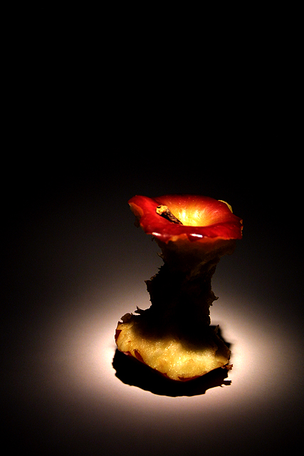
| Thanks for all your godd comments. I placed the apple on a white peace of paper and turned all the lights off. Then I just used an ordinary flashlite to light up the apple. Maby I'll hook up a 'How'd They Do That?' if you want. |
|
|
|
10/16/2002 12:53:00 PM |
| Perfection if I've ever seen it! You got my 10! I'm curious to know what you used as a light soucre??? |
|
|
|
10/14/2002 06:06:00 PM |
| this pic. looks gross but its really cool |
|
|
|
10/14/2002 12:14:00 AM |
| You did a great job here! Grayce |
|
Comments Made During the Challenge  |
|
|
10/13/2002 09:52:00 PM |
| HMMmmmm! Setzler? Classic! |
|
|
|
10/13/2002 07:53:00 PM |
| cool--love the lighting. nice subject matter, too! 9--amitchell |
|
|
|
10/13/2002 07:24:00 PM |
| nice and classic - would a black and white shot make it any more dramatic?... 8-photosbyayme |
|
|
|
10/13/2002 06:59:00 PM |
| Very well lit. Simple but effective. One of my favourite photos this week. -stephan |
|
|
|
10/13/2002 11:23:00 AM |
Composition: Subject Placement, Cropping, Background10,
Technical: Focus, Exposure, Lighting, Processing9,
Appeal: Is it Interesting, Motivating, Etc.? 7,
Total Averaged Rating9. Autool
|
|
|
|
10/13/2002 03:18:00 AM |
|
|
|
10/12/2002 08:14:00 PM |
| Shades of John Setzler. Where is the nekkid lady? 10 JEM |
|
|
|
10/12/2002 03:02:00 PM |
| I think this would have been a really great shot if there wasn't so much shadow on the middle of the apple. Maybe a side light could have helped fix that, unless you were trying for the shadow, in that case, I'll just say that it doesn't work for me. The idea is great, and I like the angle and framing/cropping you have chosen. Good luck in the challenge. ~Hbunch7187~ |
|
|
|
10/12/2002 01:25:00 PM |
| Greetings for Hickory, NC? Superb work making something inherantly ugly into something that's enjoyable to look at. |
|
|
|
10/12/2002 04:37:00 AM |
| One of my fav's of the week. Nice shot. |
|
|
|
10/12/2002 12:58:00 AM |
| Fantastic lighting makes tihs photo very dramatic. Fantastic colors as well. Great framing. Excellent use of the black space on the top of the subject. 10/10 |
|
|
|
10/10/2002 07:37:00 PM |
| i like how the light is on the top of the apple (nice colours) but it looks like the apple's been there for a while, and all the shadows are distracting. |
|
|
|
10/10/2002 05:02:00 PM |
| Off center on purpose? - bamaster (8) |
|
|
|
10/10/2002 01:54:00 PM |
| Your composition and lighting is good but I would like to see a lot of the black at the top cropped off. |
|
|
|
10/10/2002 12:39:00 PM |
| Its nice, but I think some lighting on the front to get rid of the shadow on the apple would improve it. The shadow takes away a lot of detail. - Konador |
|
|
|
10/10/2002 10:30:00 AM |
| Very nice shot - this week's most visually appealing apple core! |
|
|
|
10/08/2002 08:33:00 PM |
| This is pure trash! I never thought I'd get to use that statement as a compliment, but that's how I intend it this time :) I like this a lot -- one of my favorites so far. The lighting is quite unique and interesting. |
|
|
|
10/08/2002 06:03:00 PM |
| interesting use of light..i think i want to see the core a bit more. 8--shutterfly |
|
|
|
10/08/2002 04:51:00 PM |
| excellent job with the lighting :) - 9 - setzler |
|
|
|
10/08/2002 04:28:00 PM |
|
|
|
10/08/2002 04:26:00 PM |
| I've never seen an apple in this light before (pun intended). If it wasn't for the title I wouldn't have known what this was. Nice abstract - well executed. High Score |
|
|
|
10/08/2002 12:28:00 PM |
| The first professional quality image I have seen in this challenge. 9 nards656 |
|
|
|
10/08/2002 06:48:00 AM |
| Great lighting on this one. |
|
|
|
10/07/2002 11:39:00 PM |
7Overall
9Challenge Met
7Color (tints, casts, bleeds)
7Exposure, Lighting (Shadows, reflections)
8Focus & Clarity
9Framing, Subject Placement, Background
8Visual Appeal, Subject matter
6Would I frame or poster-board this picture?
Good use of a spot light, but overall the picture is a bit too dark for my likes. |
|
|
|
10/07/2002 11:03:00 PM |
|
|
|
10/07/2002 08:07:00 PM |
| I love the lighting on this one. 10 |
|
|
|
10/07/2002 04:26:00 PM |
| nice use of light and negative space |
|
|
|
10/07/2002 04:10:00 PM |
| Cool! Excellent lighting. |
|
|
|
10/07/2002 03:56:00 PM |
Nice picture!!!!
Good luck!
Richi |
|
|
|
10/07/2002 01:56:00 PM |
| You can eat a whole apple you know? |
|
|
|
10/07/2002 01:45:00 PM |
| I went for something similar, in the sense of making something nice about trash. I hope you do good, it's a nice picture. 2 suggestions: I would've focus the top part of the apple. and it's a bit too contrasted. |
|
|
|
10/07/2002 01:38:00 PM |
| I like the negative space, and teh lighting. Very good picture, I think. karmat |
|
|
|
10/07/2002 01:37:00 PM |
| I love the rich color, composition, and how you can see just a hint if light shining down through the top of the apple. |
|
|
|
10/07/2002 12:37:00 PM |
| Fabulous lighting and excellent clarity. I llike the use of the black space on the top. Great Job. 9 - sojourner |
|
|
|
10/07/2002 11:31:00 AM |
| I don't care for the dark shadow on the inside of the core. |
|
|
|
10/07/2002 11:29:00 AM |
| bit too dark for my liking but it defintely looks good.. |
|
|
|
10/07/2002 11:04:00 AM |
|
|
|
10/07/2002 07:11:00 AM |
| nice lighting and composition.. have a 7 |
|
|
|
10/07/2002 05:58:00 AM |
| The first shot this week that I said, "WOW". I love it, The lighting is beautiful and the colors are outstanding. I love the use of negative space as well. The only thing I can find that is not perfect is the slight glare on the front of the apple top. Close enough...10 from me. DPz |
|
|
|
10/07/2002 04:29:00 AM |
|
|
|
10/07/2002 04:09:00 AM |
|
|
|
10/07/2002 01:59:00 AM |
Technically correct , exposure, focus, saturation , contrast. 6
Good composition. 5 I dont like the black at the top
Tells a story or creates a mood 6
Impact to the viewer 5
Relevance to the Challenge 6
Overall 6
sulamk
|
|
Home -
Challenges -
Community -
League -
Photos -
Cameras -
Lenses -
Learn -
Prints! -
Help -
Terms of Use -
Privacy -
Top ^
DPChallenge, and website content and design, Copyright © 2001-2024 Challenging Technologies, LLC.
All digital photo copyrights belong to the photographers and may not be used without permission.
Current Server Time: 04/27/2024 06:31:33 AM EDT.