| Author | Thread |
Comments Made During the Challenge  |
|
|
10/19/2008 09:24:54 PM |
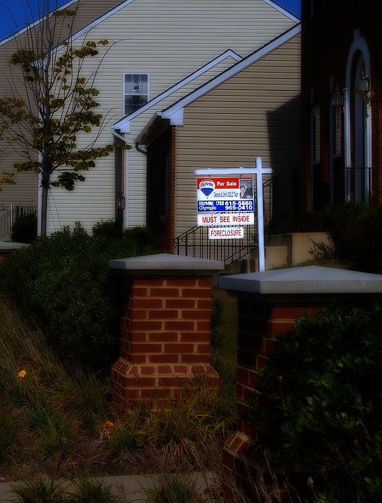
| Interesting processing. The sign almost glows. |
|
 Photographer found comment helpful. Photographer found comment helpful. |
|
|
10/19/2008 12:33:18 PM |
| For my taste, I would have preferred to see more of the tops of the houses, rather than the grass at the bottom/front. Overall, a very good take on the challenge. |
|
| Photographer found comment helpful. |
|
|
10/18/2008 03:17:55 PM |
| A little on the dark side. Hey wait...perfect! 10 |
|
| Photographer found comment helpful. |
|
|
10/16/2008 11:22:14 PM |
| Good image of current conditions, but not crazy about the softer look. |
|
| Photographer found comment helpful. |
|
|
10/15/2008 10:02:11 PM |
| Like the though, but there's too much contrast for me between the shocking white sign and the darkened background... |
|
| Photographer found comment helpful. |
|
|
10/14/2008 03:03:00 AM |
| Like the lighting on this and the soft tones but feel this is totally let down by lack of composition and a slightly boring angle. |
|
| Photographer found comment helpful. |
|
|
10/13/2008 11:05:12 AM |
| For the sign to be predominant, it could be a little clearer. Now it's oversharpened mess. Might have cropped tighter too as the other units are distracting. |
|
| Photographer found comment helpful. |
|
|
10/13/2008 12:15:50 AM |
| What a heartbreaking subject. Good concept and good execution. 9 |
|
| Photographer found comment helpful. |
Home -
Challenges -
Community -
League -
Photos -
Cameras -
Lenses -
Learn -
Prints! -
Help -
Terms of Use -
Privacy -
Top ^
DPChallenge, and website content and design, Copyright © 2001-2024 Challenging Technologies, LLC.
All digital photo copyrights belong to the photographers and may not be used without permission.
Current Server Time: 04/25/2024 01:41:00 PM EDT.