| Author | Thread |
|
|
04/12/2009 03:25:46 AM |
| Just came across this, I REALLY like it! Had a look at the others too, this is easily the best edit. Thanks for sharing the steps! |
|
 Photographer found comment helpful. Photographer found comment helpful. |
|
|
01/17/2009 04:36:28 PM |
| Since I go for emotion or artistic flare in shots, I'd pick this one. But they are all nice! |
|
| Photographer found comment helpful. |
|
|
01/12/2009 07:37:53 PM |
| I have to say that I like this version better, I am a sucker for these tones and the editing adds a mythical quality to the image |
|
| Photographer found comment helpful. |
|
|
01/11/2009 10:46:53 PM |
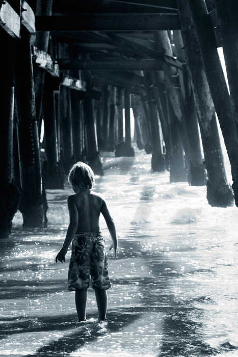
| I'll be different. I'm not so sure I like the filter used here. In comparison to the B&W one, the cast seems to take something away from this. |
|
| Photographer found comment helpful. |
|
|
01/08/2009 06:29:09 AM |
| I like this one best Deb. I like the way the shadows in the water stand out more. I would be tempted to make the farther ones a little bit darker. The more I look, the more I like it! |
|
| Photographer found comment helpful. |
|
|
01/08/2009 12:04:03 AM |
| I'm normally a sucker for B&W, but the toning in this one is fantastic. You asked about halos and shadow/highlight. I remember reading somewhere that if you crank the radius it will reduce it so that's what I normally do, although I never paid that much attention to it. |
|
| Photographer found comment helpful. |
|
|
01/06/2009 09:02:25 PM |
| I think this is my favorite edit. I love the tones and the textures. It was a great image to begin with but the mood in this edit really makes it for me. |
|
| Photographer found comment helpful. |
|
|
01/05/2009 05:46:37 AM |
This is ABSOLUTELY BRILLIANT!
I ADORE this image - so perfectly processed. |
|
| Photographer found comment helpful. |
|
|
01/04/2009 05:23:17 AM |
| No contest. This is the best one by a landslide. The edit here is supportive of the scene, it respects the mystery, the intrigue where as the other edits... is rape too harsh a word? Seriously, the other edits rob all the appeal I see here. |
|
| Photographer found comment helpful. |
|
|
01/04/2009 02:48:53 AM |
This is my favourite of the three edits, although, I would prefer if the boy was a little brighter. Have you tried doing a brightness layer, and masking out everything but the boy.
Even without the extra brightness, I really like the emotion in this shot. It really does a good job a kid being a kid. |
|
| Photographer found comment helpful. |
|
|
01/03/2009 09:31:03 PM |
| Here he does stand out nicely against the background. I like the tones and the textures in the water. |
|
| Photographer found comment helpful. |
|
|
01/03/2009 08:09:32 PM |
|
| Photographer found comment helpful. |
|
|
01/03/2009 04:39:40 PM |
| I prefer this version. My attention focuses on the activity of the boy and the textures instead of the colors. |
|
| Photographer found comment helpful. |
|
|
01/03/2009 04:38:37 PM |
| The b&w version is more ethereal and emotive. I think I prefer the b&w, but it's a tough tossup. |
|
| Photographer found comment helpful. |
Home -
Challenges -
Community -
League -
Photos -
Cameras -
Lenses -
Learn -
Prints! -
Help -
Terms of Use -
Privacy -
Top ^
DPChallenge, and website content and design, Copyright © 2001-2024 Challenging Technologies, LLC.
All digital photo copyrights belong to the photographers and may not be used without permission.
Current Server Time: 04/24/2024 09:24:49 PM EDT.