| Photograph Information |
Photographer's Comments |
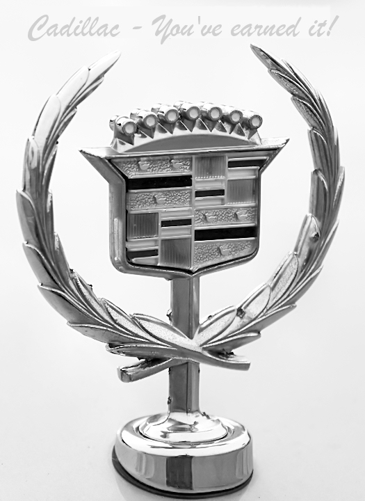
Challenge: Automobile Ad II (Advanced Editing VII*)
Collection: Portfolio
Camera: Canon EOS-500D Rebel T1i
Lens: Canon EF-S 18-55mm f/3.5-5.6 IS
Location: Derek Motorcars Co, Fort Wayne, Indiana
Date: May 24, 2009
Aperture: F/5.6
ISO: 100
Shutter: 1/640
Galleries: Advertisement, Transportation
Date Uploaded: May 24, 2009
|
Buy yours today before Government Motors brings out their new Cadicklet Michelle-0 model. This all-new vehicle is been designed by a congressional subcommittee, and has all the features deemed best for the American consumer.
Editing: White Balance, Clarify, Contrast / Lightness, Curves, Levels, Sharpen, convert to B&W, resize, neat image, curves, sharpen, add text, flatten, save for web. |
| Author | Thread |
Comments Made During the Challenge  |
|
|
05/31/2009 05:57:49 PM |
| Great tag line. Perhaps a different color font would make this more viable. |
|
 Photographer found comment helpful. Photographer found comment helpful. |
|
|
05/30/2009 01:17:17 PM |
| well executed. the little bit of dark reflections add depth and separation. |
|
| Photographer found comment helpful. |
|
|
05/27/2009 11:29:30 PM |
| I've had 4 of them and they are a wonderful car .Unfortunately I did have one of my hood ornaments stolen . Nice image |
|
| Photographer found comment helpful. |
|
|
05/26/2009 09:50:04 PM |
| good macro effort - the brightness and silver color shows elegance - i'm just not crazy about the font choice... |
|
| Photographer found comment helpful. |
|
|
05/26/2009 06:45:54 PM |
| Sweet High-Key and Black & White! :) |
|
| Photographer found comment helpful. |
|
|
05/25/2009 08:37:16 AM |
| I like the light background. I might've made the font a bit darker. |
|
| Photographer found comment helpful. |
|
|
05/25/2009 04:10:42 AM |
Classic. Whereas most others went and photographed a car, and advertised a car, you instead went the brand. What you have acheived is a very clean, crisp image, that is simple in its composition, and yet extremely effective in its message. Of those I have gone through, this is the best at selling the car......
A few very (very) minor things prehaps.
Maybe the crop is just a little tight around the image. Just a little extra negative space would have helped, so that the symbol wasn't as constrained.
The text I feel is a little light. A darker silver I think would have been better. Avoiding black though was a good choice.
An excelent image, and overall composition for this challenge. |
|
| Photographer found comment helpful. |
Home -
Challenges -
Community -
League -
Photos -
Cameras -
Lenses -
Learn -
Prints! -
Help -
Terms of Use -
Privacy -
Top ^
DPChallenge, and website content and design, Copyright © 2001-2024 Challenging Technologies, LLC.
All digital photo copyrights belong to the photographers and may not be used without permission.
Current Server Time: 04/19/2024 02:29:11 PM EDT.