| Author | Thread |
|
|
12/06/2010 01:36:57 AM |
|
 Photographer found comment helpful. Photographer found comment helpful. |
|
|
11/19/2009 06:25:34 PM |
| I love the processing. Excellent job. |
|
| Photographer found comment helpful. |
|
|
10/28/2009 09:20:56 AM |

Critique Club Critique
First Impressions
I like this. Really like the processing and it suits your title and the Challenge well.
Photograph Information, Technicals & Composition Review
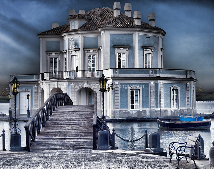
A lot of processing there (just read your Photographer's Comments). The effect is good. I do wish this image had a whisker nudge up on the left to straighten the building (house!). I like the bridge placement in the composition, but do wonder whether more drama could have been achieved in this image overall by a slightly more angled perspective. Minor, but the bench/seat element detracts slightly from the 'fantasy' mood and feel of the building and what it conjures up in the imagination, especially with the help of your good title.
Maybe a little darker overall, but that is personal taste. The bottom right chain post/structure perhaps cropped and/or cloned out would be better, however I do see the boat dilemma.
Comments, Score & Placement Review
5/81 is excellent scoring and your score of 6.83 very strong.
You received a good mix of interesting and well thought out comments. I tend to wonder also about this not cropped so tightly and allowing a little more 'distance'. But maybe that was not possible with the surrounds or maybe you wanted it this tightly cropped.
Summary
Despite what I said above about the bridge, it is slightly unsettling that the 'leading line'' (entrance) to the building is positioned in the left of frame - for some reason I find it hard to be easily 'drawn into' the building - if that makes sense. I like the contrasting effects within the image and for me, a little more depth/darkness and drama, would have packed a little more punch. |
|
| Photographer found comment helpful. |
|
|
10/26/2009 12:44:38 PM |
Great tones. I like the drama in the shot. Congrats on your HM.
Raj |
|
| Photographer found comment helpful. |
|
|
10/26/2009 11:16:10 AM |
|
| Photographer found comment helpful. |
|
|
10/26/2009 03:18:23 AM |
| WOW - love the colors and the whole texture to this! Congrats on 5th! |
|
| Photographer found comment helpful. |
|
|
10/26/2009 02:41:13 AM |
| Congrats on the star for 5th and a new personal best! |
|
| Photographer found comment helpful. |
|
|
10/26/2009 12:23:48 AM |
| I new this would do well, congrat's on your HM. |
|
| Photographer found comment helpful. |
Comments Made During the Challenge  |
|
|
10/25/2009 11:02:45 PM |
| Lovely work ..just like a painting |
|
| Photographer found comment helpful. |
|
|
10/25/2009 10:03:36 PM |
| Love the blue color tones. The detail and light look great. It seems too bright tho to be a place where a dark phantom would live. I hope you wrote down where this is. It looks like a really interesting place to visit. |
|
| Photographer found comment helpful. |
|
|
10/25/2009 08:07:21 PM |
| Wow, excellent processing! |
|
| Photographer found comment helpful. |
|
|
10/24/2009 10:37:14 PM |
| i like the way the building seems to stand out from the background. very interesting editing. wait, actually, i love all that. 10 |
|
| Photographer found comment helpful. |
|
|
10/23/2009 10:24:12 AM |
| Maybe a touch chopped, as far as the feel of the crop. I wonder if it wouldn't have been better from farther away. Nice title too - works for a movie for sure. |
|
| Photographer found comment helpful. |
|
|
10/21/2009 10:32:24 AM |
|
| Photographer found comment helpful. |
|
|
10/20/2009 10:46:43 PM |
|
| Photographer found comment helpful. |
|
|
10/20/2009 06:00:12 PM |
| Awesome shot. Great colors. Looks like an ice castle. |
|
| Photographer found comment helpful. |
|
|
10/20/2009 01:33:06 PM |
| spooky shot, great colors and mood |
|
| Photographer found comment helpful. |
|
|
10/20/2009 08:47:22 AM |
| Great pp on this. The title is excellent as well. |
|
| Photographer found comment helpful. |
|
|
10/20/2009 12:57:29 AM |
| Beautiful place, and brilliantly photographed/processed to make me feel like I definitely shouldn't go there. I'm sure the 'movie' will show me why. 10 |
|
| Photographer found comment helpful. |
|
|
10/19/2009 06:35:40 PM |
| I just love the colors of your picture. I'd have to say this is a favorite! :) |
|
| Photographer found comment helpful. |
|
|
10/19/2009 05:20:24 PM |
| Stunningly well post-processed; should look overdone but this is really working for me. Bags of atmosphere and a pretty good title - should make the top five. |
|
| Photographer found comment helpful. |
|
|
10/19/2009 04:22:51 PM |
| Not poster orientation. Nothing really suggesting the title in the image. |
|
| Photographer found comment helpful. |
|
|
10/19/2009 10:43:02 AM |
| What a fantastic idea. I like it. At first glance it isnt quite straight (rotation wise), but it might just be the angle and architecture. |
|
| Photographer found comment helpful. |
|
|
10/19/2009 07:58:25 AM |
| Nice processing. But, I think the crop is too tight for this massive structure and that drama in the clouds. Don't know if you have room while shooting. |
|
| Photographer found comment helpful. |
|
|
10/19/2009 07:42:25 AM |
| This image caught my eye from the thumbnail but when I opened it I was kind of disappointed to see the sky so dark. Not that this isn't a good image but I think you used topaz or similar too much. I like the look of a clean HDR but I get the feeling you started editing this photo but never finished. The building is absolutely beautiful and I but this would look really good just after sundown with a longer shutter speed to smooth out the water and allow the lights to shine through. |
|
| Photographer found comment helpful. |
|
|
10/19/2009 07:33:53 AM |
|
| Photographer found comment helpful. |
|
|
10/19/2009 12:24:02 AM |
|
| Photographer found comment helpful. |
Home -
Challenges -
Community -
League -
Photos -
Cameras -
Lenses -
Learn -
Prints! -
Help -
Terms of Use -
Privacy -
Top ^
DPChallenge, and website content and design, Copyright © 2001-2024 Challenging Technologies, LLC.
All digital photo copyrights belong to the photographers and may not be used without permission.
Current Server Time: 04/19/2024 05:02:51 AM EDT.