| Author | Thread |
Comments Made During the Challenge  |
|
|
06/27/2004 10:46:23 AM |
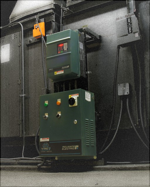
| Great technique with the grainy black and white. Maybe there could be a better composition somewhere in there with just one of the green boxes- but genereally this is well done and interesting |
|
 Photographer found comment helpful. Photographer found comment helpful. |
|
|
06/27/2004 09:07:32 AM |
| This photo is a little grainy and there doesn't seem to be any purpose to the desaturation. In other words, the wall could very well be shades of gray, so the colored portion don't really stand out. |
|
|
|
06/25/2004 04:57:31 PM |
| Hmm..first think i noticed was the noise although it is only apparent on the black and white portion of the photo. |
|
| Photographer found comment helpful. |
|
|
06/25/2004 03:44:51 AM |
| Nothing for the viewer to identify with and realize what colors are missing. In this pic - I can't tell what you desaturated. |
|
|
|
06/24/2004 02:08:43 PM |
| It looks like you managed the technique pretty well. Although I appreciate the pattern the boxes make, somewhat, I don't find this angled view that appealing. A straight-on composition would have flattened the shapes into a more abstract composition of squares and llines and added interest to what is essentially a very mundane subject. |
|
| Photographer found comment helpful. |
|
|
06/24/2004 03:18:33 AM |
| Not sure if this is good subject for this challenge. |
|
| Photographer found comment helpful. |
|
|
06/22/2004 11:20:19 AM |
| Good job. A little too grainy maybe. |
|
| Photographer found comment helpful. |
|
|
06/21/2004 02:43:27 PM |
| I like the shot, but I'm a bit distracted by the noise. |
|
| Photographer found comment helpful. |
|
|
06/21/2004 04:29:53 AM |
| i think it would have been stronger if you just highligthed the dial. |
|
| Photographer found comment helpful. |
Home -
Challenges -
Community -
League -
Photos -
Cameras -
Lenses -
Learn -
Prints! -
Help -
Terms of Use -
Privacy -
Top ^
DPChallenge, and website content and design, Copyright © 2001-2024 Challenging Technologies, LLC.
All digital photo copyrights belong to the photographers and may not be used without permission.
Current Server Time: 04/24/2024 08:54:23 AM EDT.