| Author | Thread |
|
|
12/22/2009 02:44:02 PM |
Hello! You have requested a comment from the critique club:
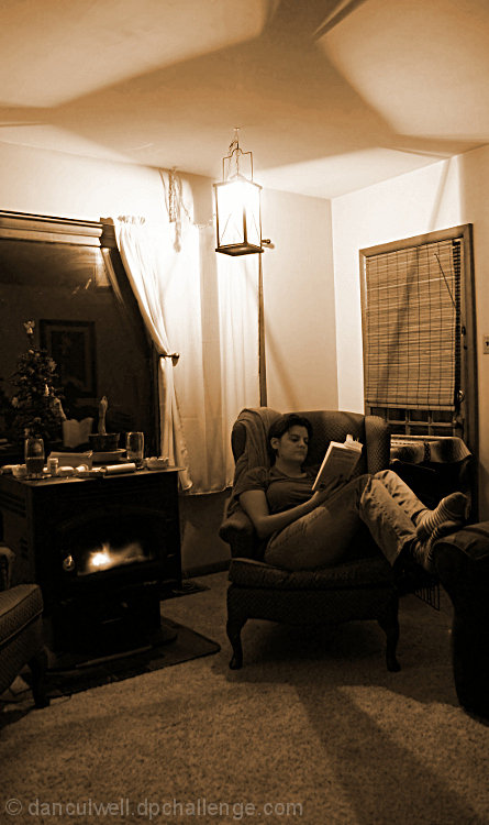
First Impression/Opinion: while it definitely fits the challenge, i am at first distracted by the furniture before i even look up to see the light! the shadow on top of the ceiling is cool though! i don\'t see a definite clear subject
Composition: there seems to be two main subjects here that are fighting for attention your wife and the light. a different angle may have helped get one or the other the main focus. The furniture seems to be cluttering up the image also.
Post Processing: i see a yellowish color tint to the image. I don\'t know if that was intentional but i think black and white may have been a better choice. More contrast may have made those shadows give more impact also.
Challenge Criteria: definitely fits the challenge
good luck on your future challenges!
Message edited by author 2009-12-22 14:47:15. |
|
 Photographer found comment helpful. Photographer found comment helpful. |
Comments Made During the Challenge  |
|
|
12/15/2009 01:36:18 AM |
| Image meets challenge. I would prefer a closer shot low down of her reading with the light above her head and less room clutter. More impact. |
|
| Photographer found comment helpful. |
|
|
12/15/2009 12:45:14 AM |
| I like this concept, but I think, the contrast would need to be stronger (the shadows darker). |
|
| Photographer found comment helpful. |
|
|
12/13/2009 09:52:12 PM |
| Cool shadows being cast by the light. 7 |
|
| Photographer found comment helpful. |
|
|
12/09/2009 04:42:02 PM |
|
Home -
Challenges -
Community -
League -
Photos -
Cameras -
Lenses -
Learn -
Prints! -
Help -
Terms of Use -
Privacy -
Top ^
DPChallenge, and website content and design, Copyright © 2001-2024 Challenging Technologies, LLC.
All digital photo copyrights belong to the photographers and may not be used without permission.
Current Server Time: 04/27/2024 08:12:37 PM EDT.