| You are not logged in. (log in or register) | |
 |
|
Tutorials :: Lighting II: Studio Effects
Lighting II: Studio Effects by KevinRiggsWhen shooting indoors a photographer has several options for lighting a scene or subject. The purpose of this tutorial is to extend the introduction given to flash lighting by delving into lighting setups and the effects that result from using monolights or flash heads and powerpacks. I encourage any reader that the equipment discussed herein is not necessary for any particular purpose; it is merely often a topic of questions as people consider what to add to their photography hobbies/businesses. Following the linked thumbnails will allow the viewer to see the settings and equipment used in each photo below. Lighting becomes one element that affects the overall composition. It can direct the viewer to a single component of the scene or it can create a tone that runs throughout the photo. One place where a photographer can attain complete control over lighting is in a studio setting. In my studio, I use Alien Bee B-800 monolights (320 true watt seconds). I incorporate a mix of light modifiers like softboxes, barn doors, honeycombs, umbrellas, etc. When you connect your camera to a single light via a sync cord or radio remote, you need to set your shutter speed no faster than the fastest x-sync speed that your camera supports. Set your shutter speed any faster than the top sync speed and you will see vignetting at the top/bottom or sides of the photo depending on how your camera’s shutter assembly is constructed. For those of you wondering, the strobe that is connected via cord or remote will trigger the other stobes as most monolights or flash heads & power packs come equipped with a light sensitive trigger. 
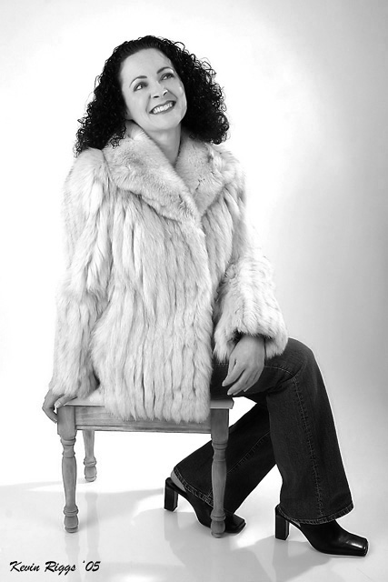
Fig 1 As you experiment with studio lighting you may find that simple results you were satisfied with give way to more complex lighting designs. In respect to my own work I’ll start with a lighting setup that lights a subject so that few shadows are present and the subject can be easily seen and distinguished from the background. In Fig 1 you can see that the details of the subject have been rendered fairly cleanly. The viewer can see details of the eyes, the hair silhouette and coat clearly. This type of lighting lends itself when the impact of the photo is going to depend on the subject’s expression, the composition or some element other than the lighting. In this lighting scenario the lighting is not meant to add dramatic effects; it is fairly flat. 
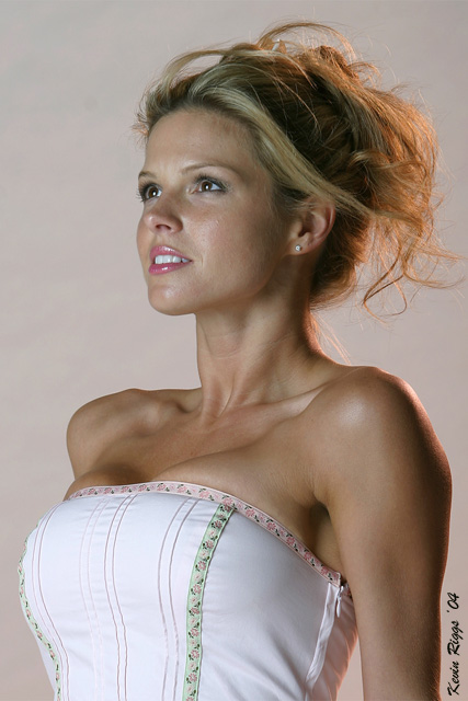
Fig 2 For a different style of lighting we’ll switch to opposing lights. In my experience this is a style of lighting where the photographer can use a key light to present elements of the subject but little attention is paid to using a strong fill light as the shadows created by the key light are used to demonstrate depth, texture or interest in the subject. For my illustration I’ve chosen to use a photo (Fig 2) that also exemplifies using a strong hair/rim lighting. In this shot you can see how the key light is off to camera left and above the subject. Due to the subject’s strong facial features and physique this lighting works well to light her eyes and lips while creating soft shadows that demonstrate her feminine jaw line and accentuate her shoulders and collarbone. In this image the goal was not to light every visible surface of the subject; it was to demonstrate the dichotomy between her femininity and her toned body. To help give depth to this representation, we used a kicker light behind the subject; this light was almost exactly opposite the key light. The kicker also had a large softbox but it was moved farther from the subject and had an orange warming gel inserted into it. This had the effect of lighting the hair and back so that the viewer is allowed to see the key light fading to shadow around the curves of a woman’s body (notice the neckline and arm/shoulder) before being given enough light to distinguish the outline of the subject. The warming gel simply helps to create an inviting atmosphere. 
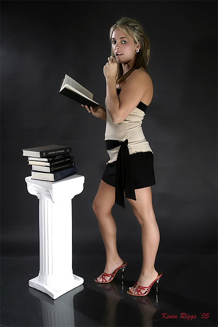
Fig 3 Another way to create dimension in a photo is to move the light sources. We are used to seeing others lit from above most often (whether indoors or outdoors). To create an effect that gives some intrigue to a photo try moving a light source to produce unexpected shadows or highlights. In Fig 3 I moved the softbox-modified key light off the light stand and laid the light on the ground with the softbox aimed up at the subject. This gave the effect of creating shadows the farther up the subject’s body the light went. The subject’s legs would have been the most well-lit element of this composition but to mitigate the strong light on the legs I used a kicker light opposite the key light. The kicker was above the subject and modified with barn doors to limit the light spill over. This modifier ends up leaving the bare strobe an open path to pour light out onto the scene but the photographer maintains some control over where the light goes. In this example the light was intentionally limited in its effects on the background and in how much was allowed to shine towards the camera (which would have given specular highlights). Using this bare strobe effect allows the subject’s face to be lit in close proportion to the lower part of the photo. I think I missed the ratio here as I think the softbox should have been turned down by about 1/4 of a stop to keep from blowing out the details on the pillar. Another tool that could have been used here would have been a honeycomb but because I wanted my kicker’s light to traverse from the top of the subject to the floor I chose the barn door solution. A honeycomb narrows and focuses the beam from a strobe but it also has the (in this instance) unwanted effect of casting a circular column of light instead of giving off a variable square or rectangle of light so for my purposes, the barn doors were preferable here. To finish out this shot I moved a softbox in from camera left and turned it down so that it barely knocked out any shadows but I liked the effects it helped produce on this shot. 
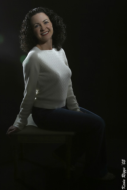
Fig 4 In the final shot I delved into more dramatic lighting (perhaps to my detriment). This is a style of lighting that I plan to master. I know that similar effects can be produced on the computer but to me part of the desire is to understand and be able to implement the principles of lighting that are incorporated in such a photo. Fig 4 shows a mostly dark subject where lighting is used to keep her from blending into the darkness. For a subject with such dark hair and such a light top I found it challenging to keep her hair from disappearing while trying to keep her top from overpowering her face (don’t think I completely got that last part). In this shot I used a 20 degree honeycomb (the bigger the number, the faster the cone of light from the strobe spreads out). The 20 degree honeycomb was behind the subject to camera right. It is creating some of the highlights seen in her hair over her left shoulder. To camera left I used barn doors above and behind the subject to generate highlights not only along her right shoulder but also in her hair. I didn’t close down the barn doors enough and you can see the effects in a light dot of highlight just behind her right shoulder. The key light for this composition was set to camera right and was raised above the subject. This light utilized a 10 degree honeycomb. I misaligned this light as it hits her forehead just over her left eye. Had I moved that light down and towards the center of her face more this should would have turned out more even in its lighting. Using another 10 degree honeycomb instead of the 20 degree would have lessened the amount of light that fell across her chest by keeping it more focused on her hair and creating more highlights on her shoulder and in her hair. These are some effects that can be achieved with moonlights or flash heads and powerpacks in a studio setting. They are not meant to be comprehensive, nor as great examples but my hope is that this will demonstrate to some readers what effects can be achieved by strobes and modifiers before people run out and drop tons of money on something that they may not actually be interested in using. Conversely, I hope you may see some effect that you’d like to try and maybe this tutorial will be an aid in you figuring out some tool that will help you achieve that effect you want. Kevin
Home -
Challenges -
Community -
League -
Photos -
Cameras -
Lenses -
Learn -
Help -
Terms of Use -
Privacy -
Top ^
DPChallenge, and website content and design, Copyright © 2001-2024 Challenging Technologies, LLC. All digital photo copyrights belong to the photographers and may not be used without permission. Current Server Time: 11/23/2024 08:01:18 AM EST. |