| Image |
Comment |
| 11/11/2003 05:21:47 PM |
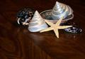
Tiny treasuresby wolfenComment by Shannon: I personally don't care much for the table as a background, I think it would have looked better on a solid white or black or other background. |
 Photographer found comment helpful. Photographer found comment helpful. |
| 11/10/2003 02:54:10 PM |
Tiny treasuresby wolfenComment by jodiecoston: Good use of composition and getting in close to not have background elements distracting. A soft warm-colored side light would really make this pop and give it "mood". |
| Photographer found comment helpful. |
| 11/09/2003 09:36:39 PM |
Tiny treasuresby wolfenComment by dr rick: I like the selection of objects and the way you've arranged them. The lighting is good too. But I don't care for the composition; the negative space detracts from the feeling of the image. It also needs to be a little sharper. |
| Photographer found comment helpful. |
| 11/08/2003 02:59:31 PM |
Tiny treasuresby wolfenComment by banmorn: Whilte you made some attempt at composition, I do not feel that what you came up with is the best you might have done. The background is a bit dark but that's OK as it provides some contrast to your subjects and the grain of the wood makes it less static thana plain BG. Feel it could have been lit better , maybe lose the plate as it seems like 'which one does not belong, class' and repositioned the remaing subjects for better comp. 5 |
| Photographer found comment helpful. |
| 11/06/2003 09:35:35 PM |
|
| Photographer found comment helpful. |
| 11/06/2003 11:29:12 AM |
Tiny treasuresby wolfenComment by ScantyNebula: I don't like the wood surface, especially since the grain is not aligned straight
the lighting could be improved |
| Photographer found comment helpful. |
| 11/05/2003 01:33:00 AM |
Tiny treasuresby wolfenComment by kinks: Treasures are nice, but i do not like composition. Bit brighter ground would work for me better - 6 |
| Photographer found comment helpful. |
| 10/28/2003 07:14:20 PM |
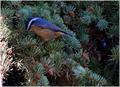
All spruced up and no place to goby wolfenComment by LucidLotus: Cute title. A very nice image. Focus is great, the color of the bird is marvelous. Fits the challenge well - a lot of general interest. I would recommend cropping out the sunlight part - I find it a distractant. Also, that blue thing in the tree to the right - is that an ornament? Looks kind of metallic blue so it draws the eye. A good sound image. 6 |
| Photographer found comment helpful. |
| 10/23/2003 09:02:16 PM |
|
| Photographer found comment helpful. |
| 10/23/2003 05:22:41 PM |
|
| Photographer found comment helpful. |
Home -
Challenges -
Community -
League -
Photos -
Cameras -
Lenses -
Learn -
Help -
Terms of Use -
Privacy -
Top ^
DPChallenge, and website content and design, Copyright © 2001-2025 Challenging Technologies, LLC.
All digital photo copyrights belong to the photographers and may not be used without permission.
Current Server Time: 03/12/2025 05:19:09 PM EDT.