| Image |
Comment |
| 03/29/2004 10:40:40 PM |
|
 Photographer found comment helpful. Photographer found comment helpful. |
| 03/25/2004 11:20:02 AM |
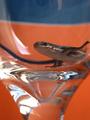
Potrait of a Skinkby KentuckyGalComment by orussell: I think this would have worked better if the orange was a little more vivid, maybe by saturating more or playing with levels (using the white point and black point eye droppers you can remove some of the colour cast and make it more vivid, also USM 125%, radius 0.3, threshold 1 - I tried it - makes the image 100% better) Contact me after the challenge and I'll send the editted copy if you like. |
| Photographer found comment helpful. |
| 02/28/2004 12:02:22 PM |
|
| Photographer found comment helpful. |
| 02/25/2004 08:39:37 PM |
|
| Photographer found comment helpful. |
| 02/25/2004 05:46:00 PM |
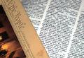
We The Peopleby KentuckyGalComment by johnnymoretti: Not sure this isn't two pictures put together using software. If not, I would have liked it more if there was a shadow from the 'we the people' cast on the dictionary. Would have given it depth. Othewise its flat to me. But this is only my opinion. |
| Photographer found comment helpful. |
| 02/25/2004 01:35:03 PM |
|
| Photographer found comment helpful. |
| 02/21/2004 05:38:25 AM |
Copper Shineby KentuckyGalComment by faidoi: The piled up pennies gives a feeling of scales of an animal. Very interesting idea. The composition would really be brought out if lighting was from the sides so that highlights and shadow would make the subjects pop out of the shot. Currently the hotspot on the one penny is distracting. "7' |
| Photographer found comment helpful. |
| 02/21/2004 12:41:29 AM |
|
| Photographer found comment helpful. |
| 02/20/2004 10:13:01 AM |
Copper Shineby KentuckyGalComment by sfalice: This is a good take on the Challenge. Maybe a little hot on some of the pennies, but not bad. To make this really interesting, you might try adding another shape or contrasting color as a foil. Nevertheless, it's a creditable job! |
| Photographer found comment helpful. |
| 02/20/2004 04:53:01 AM |
Copper Shineby KentuckyGalComment by e301: Too much of a direct reflection, and too much brighter than the rest of the coins - in short the balance of the light you've used to reflect, and the ambient lighting is too heavy. Wiped out almost all details in that bright coin, which because of its brightness is what really draws the yee in this shot. And with the detail goes the texture. |
| Photographer found comment helpful. |
Home -
Challenges -
Community -
League -
Photos -
Cameras -
Lenses -
Learn -
Help -
Terms of Use -
Privacy -
Top ^
DPChallenge, and website content and design, Copyright © 2001-2025 Challenging Technologies, LLC.
All digital photo copyrights belong to the photographers and may not be used without permission.
Current Server Time: 04/26/2025 12:09:06 PM EDT.