| Image |
Comment |
| 03/07/2015 06:16:37 PM |
|
 Photographer found comment helpful. Photographer found comment helpful. |
| 03/06/2015 11:57:49 PM |
|
| Photographer found comment helpful. |
| 10/24/2011 06:14:48 PM |
|
| Photographer found comment helpful. |
| 09/14/2008 05:05:21 PM |
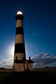
Bodie Island Lighthouse by Nightby jmleliiComment by ElGordo: I think the subdued light on the lighthouse is good just as it is. The stars in the background are a big plus. Colors in the lighthouse and the sky are a nice complementary contrast. What's not to like!!! |
| Photographer found comment helpful. |
| 09/13/2008 10:03:41 AM |
Bodie Island Lighthouse by Nightby jmleliiComment by bassbone: I agree that the composition and perspective are excellent - with the moon behind to backlight. I also agree with Magen about the shadows in front. Maybe a reflector to light paint the front of the lighthouse might be cool to try |
| Photographer found comment helpful. |
| 09/13/2008 12:05:22 AM |
Bodie Island Lighthouse by Nightby jmleliiComment by magenmarie: Lovely shot. I really like that you can see the stars in the sky... but the front of the lighthouse is in the shadows. Not a huge deal, I still really like the pick. Composition is lovely, and the colors are great. |
| Photographer found comment helpful. |
| 08/13/2008 12:27:11 AM |
jeremy-10017.jpgby jmleliiComment by levyj413: I like the gradient in the sky, and the concept, but there are several things that detract for me: the sunglasses, the very large part of the image that's pure black, and the tiny size of the kite. |
| Photographer found comment helpful. |
| 08/12/2008 11:41:03 PM |
jeremy-10017.jpgby jmleliiComment by PhillyD: Aside from what has already been noted, the thing that catches my eye first is his sun glasses. They go against the whole silhouette. |
| Photographer found comment helpful. |
| 08/12/2008 11:27:51 PM |
jeremy-10017.jpgby jmleliiComment by LadyK: well, id perfer it if the guy was in focus, maybe a high f/stop could have done it. tripod might have been a good idea too |
| Photographer found comment helpful. |
| 08/12/2008 11:25:38 PM |
jeremy-10017.jpgby jmleliiComment by briantammy: honestly the first thing that caught my eye was the out-of-focus arm. it might work better if it were in focus or more out of focus. it looks like neither. i like the perspective of the shot but i think the kite would look better a little closer. |
| Photographer found comment helpful. |
Home -
Challenges -
Community -
League -
Photos -
Cameras -
Lenses -
Learn -
Help -
Terms of Use -
Privacy -
Top ^
DPChallenge, and website content and design, Copyright © 2001-2025 Challenging Technologies, LLC.
All digital photo copyrights belong to the photographers and may not be used without permission.
Current Server Time: 04/02/2025 07:18:23 PM EDT.