| Image |
Comment |
| 09/21/2002 10:27:00 PM |
Hannahby ZeissmanComment by jmattys: I'm sure it's been said before and I'll say it again: beautiful baby! Nice clarity. How did you get her to raise her pinkie just so? 8 |
 Photographer found comment helpful. Photographer found comment helpful. |
| 09/21/2002 12:46:00 PM |
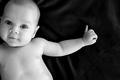
Hannahby ZeissmanComment by Kavey: I am not usually a fan of baby shots at all, nor do I usually mark them highly, so this is an exception for me. The shapes here are just fantastic. The angle of her head, and the way her arm pushes into the negative space are exactly right. Makes for a great composition. The highlights in her eyes are great and you've caught her hint of a smile so well. There's a little too much blow out in the highlights of her skin, but not massively so. Great shot! 9, Kavey |
| Photographer found comment helpful. |
| 09/21/2002 11:51:00 AM |
Hannahby ZeissmanComment by Gordon: Fantastic - great contrast with the background - excellent expression and framing. Only issue is it seems a bit soft focused on the eyes - maybe worth experiementing with setting the focus on the eyes and reframing, if you don't already do that, or maybe different sharpening settings 10 - Gordon |
| Photographer found comment helpful. |
| 09/20/2002 06:50:00 AM |
Hannahby ZeissmanComment by hypoStiller: You have captured an adorable baby in a pose balanced between awkward and graceful. Something about the extended pinky adds interest to me, suggesting future sophistication (the way some people drink wine) and future language (lettering in Sign). At first, I wanted the background to be stark black, but the hints of velvet-highlight are ultimately okay with me. They are a little like the lines a cartoonist draws around a subject to suggest movement. The negative space in this case swirls my eye around the hand, then tosses me back to the rewarding image of such a cutie. I would have preferred more contrast in the baby, but you caught a wonderful expression. 8 |
| Photographer found comment helpful. |
| 09/18/2002 03:16:00 PM |
Hannahby ZeissmanComment by karmat: I like this shot. I think the "negative space" on the right does a good job of focusing the eyes on the childs face. What i really like though, is how the frame looks like it is tilting her head for her. Does that make sense. Like she is pushed all the way against the edge. You captured a great expression, as well. Sorry if you get grief for "kid pics" -- I like this one. karmat |
| Photographer found comment helpful. |
| 09/18/2002 08:01:00 AM |
Hannahby ZeissmanComment by undieyatch: At first I thought a 5, just another gobbler picture....... but the arm extended to the right into the dark (your negative space) with the little finger pointing up is a unique expression captured. Seven. |
| Photographer found comment helpful. |
| 09/18/2002 07:58:00 AM |
Hannahby ZeissmanComment by floyd: EXCELLENT framing and lovely contrasts. Looks a little over sharpened on the bottom of her arm - I see a white fringe. Overall, though, superb. 9 - floyd |
| Photographer found comment helpful. |
| 09/18/2002 07:53:00 AM |
|
| Photographer found comment helpful. |
| 09/18/2002 07:20:00 AM |
Hannahby ZeissmanComment by Martin: Normally I don't like baby photos because someone elses baby is not nearly as appealing to me as they are to the photographer but this shot is perfection. The b/w was a excellent choice. The composition is fantastic, as is the lighting. It would have been a 10 but the light around the arm and torso edges are abit of a let down. 9-Martin |
| Photographer found comment helpful. |
| 09/17/2002 10:47:00 AM |
|
| Photographer found comment helpful. |
Home -
Challenges -
Community -
League -
Photos -
Cameras -
Lenses -
Learn -
Help -
Terms of Use -
Privacy -
Top ^
DPChallenge, and website content and design, Copyright © 2001-2025 Challenging Technologies, LLC.
All digital photo copyrights belong to the photographers and may not be used without permission.
Current Server Time: 03/31/2025 09:12:28 PM EDT.