| Image |
Comment |
| 05/17/2004 03:44:03 PM |
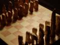
chessmenby MorbidAngelComment by beckettboots: The softness of this is actually pretty pleasing, but I don't quite get the opposite part of it becaus the color of the pieces looks the same. I like the diagonal angle of your composition and framing to allow for the very high king piece. The contrast could be bumped a little higher even if you want to keep it soft. |
 Photographer found comment helpful. Photographer found comment helpful. |
| 05/16/2004 09:30:25 AM |
chessmenby MorbidAngelComment by Count: Good idea for the challenge, GREAT framing of the picture, needs focus... rework this photo and I think you could have a winner! |
| Photographer found comment helpful. |
| 05/14/2004 08:51:24 PM |
chessmenby MorbidAngelComment by boomer: Terrible focus! Even if that were fixed, the image is static. Chessmen lined up on a chessboard. What's different about YOUR perspective? Try different angles, get the thing focused, work on better lighting, move some of the pieces around, and you'll have something interesting. |
| Photographer found comment helpful. |
| 05/13/2004 08:12:49 AM |
chessmenby MorbidAngelComment by Neil: I'm sure you've received a lot of comments that have told you this is out of focus (OOF). But I am guessing you knew that. So let's look at something else. It's hard, in this depiction, to tell that the chess players are different. The colors are the same in this very dark image. There is a good feeling of "opposition" though, from the angle you've chosen. But the tight crop here, combined with it being dark and OOF, doesn't have any dynamic, or "pop" as some people refer to it. |
| Photographer found comment helpful. |
| 05/12/2004 07:26:52 AM |
chessmenby MorbidAngelComment by Pidd: If the lack of focus is intentional, it doesn't work at all, I'm afraid. Also, I think the idea of using a chess game to illustrate opposites is a good idea, but it might be more effective if the pieces were the more traditional black & white kind to bring the point home. The similar colors of the pieces and the shadows don't illustrate the theme as well as if there were more stark contrast. |
| Photographer found comment helpful. |
| 05/12/2004 02:10:35 AM |
chessmenby MorbidAngelComment by trying2bstill: I like the shadows. Bringing the light lower would make the shadows longer, and I think they that would be more interesting. But either way, the lack of focus ruins it for me. 3. |
| Photographer found comment helpful. |
Home -
Challenges -
Community -
League -
Photos -
Cameras -
Lenses -
Learn -
Help -
Terms of Use -
Privacy -
Top ^
DPChallenge, and website content and design, Copyright © 2001-2025 Challenging Technologies, LLC.
All digital photo copyrights belong to the photographers and may not be used without permission.
Current Server Time: 03/12/2025 10:10:04 PM EDT.