| Image |
Comment |
| 01/07/2011 03:47:42 AM |
|
 Photographer found comment helpful. Photographer found comment helpful. |
| 01/06/2011 03:58:21 PM |
|
| Photographer found comment helpful. |
| 04/19/2006 09:50:55 AM |
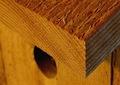
Cedarby joebokComment by e301: from the Critique Club
I think perhaps it was simple choice of subject that let you down here, in challenge terms. Certainly there is texture available, and reasonably well defined in your image, but there isn't the ping of a new vision to add to it. Perhaps if you could have manipulated the available light a touch to enphasise the ridges of the wood, or perhaps have taken the contrast even further, it might have had more success. I also wonder if your composition might not have been more thoroughly thought out: the conjunction of that angle of the roof (?) and the hold of the bird house might have been happier in compositional terms: place the hole so as not to obscured by the wood, whilst keeping the strong diagonal of the roof, and you'd have some more impact, and some balance across the image frame more than you have here.
I like that you've filled the frame, although that perhaps was an obvious idea and didn't help with the stand-out-in-a-crowd necessity of these challenges. It's a pleasant enough shot, but just doesn't have that impact, and you get so little time to hit the voters here. |
| Photographer found comment helpful. |
| 04/13/2006 04:44:41 PM |
Cedarby joebokComment by tazza: nice, unusual macro and great texture! I can almost smell the freshly cut wood... |
| Photographer found comment helpful. |
| 04/11/2006 03:53:37 PM |
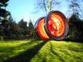
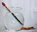
Trick of the Lightby joebokComment by adrian45: I am not sure what I am looking at here!
The pencil seems to have changed into some sort of metal item in the bowl, but I am uncertain if it is a knife or fork handle, or what. I think I would like it more if I was more sure of what it reminds me of
A nice image though, and I wish you luck |
| Photographer found comment helpful. |
| 04/11/2006 01:50:26 PM |
Trick of the Lightby joebokComment by skylen: The background needs to be a bit brighter or more uniform. Overall I'd prefer the image to be brighter and the background to have less distracting creases. I recommend putting lights on the background to make it brighter, then either increase the exposure or use the Levels or Curves tool to bump up the brightness, making the background pure white. |
| Photographer found comment helpful. |
| 04/11/2006 11:31:48 AM |
|
| Photographer found comment helpful. |
| 04/10/2006 07:17:10 PM |
Cedarby joebokComment by macrothing: 7 - Nice concept and composition. Perhaps a tweaking of the 'lighting', the little bit of 'fluff' removed and a little sharper, make this even better in my opinion. |
| Photographer found comment helpful. |
| 04/10/2006 09:41:11 AM |
|
| Photographer found comment helpful. |
| 04/10/2006 12:23:26 AM |
|
| Photographer found comment helpful. |
Home -
Challenges -
Community -
League -
Photos -
Cameras -
Lenses -
Learn -
Help -
Terms of Use -
Privacy -
Top ^
DPChallenge, and website content and design, Copyright © 2001-2025 Challenging Technologies, LLC.
All digital photo copyrights belong to the photographers and may not be used without permission.
Current Server Time: 04/02/2025 03:56:20 AM EDT.