| Image |
Comment |
| 02/28/2005 02:56:34 PM |
|
 Photographer found comment helpful. Photographer found comment helpful. |
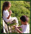
| 02/28/2005 01:19:42 AM |
Fun Timeby oracleComment by JPR: Very cute and interesting angle and composition. I wonder what they are doing with the flowers. |
| Photographer found comment helpful. |
| 02/07/2005 01:46:20 PM |
Going Nowhereby oracleComment by sibeling: Seems like it would have been easier to have a "forward only" sign, instead of this mess... well observed with a great title! The signs seem a bit gray - in Photoshop (or what have you), you can make the whites of the signs be truely white by using Levels, and it would have made the photo brighter & not so murky. |
| Photographer found comment helpful. |
| 02/02/2005 04:14:10 PM |
|
| Photographer found comment helpful. |
| 02/02/2005 11:10:19 AM |
Going Nowhereby oracleComment by mcrochip: Content is good... composition I'm thinking is a bit boring. There's just no context here to place the signs. |
| Photographer found comment helpful. |
| 02/02/2005 10:49:17 AM |
Going Nowhereby oracleComment by scuds: Finally found the end of the world! Can't go nowhere, besides going back.
Loved the composition on this image! |
| Photographer found comment helpful. |
| 02/02/2005 07:49:12 AM |
Going Nowhereby oracleComment by notonline: Great signs but its not the clearest shot I've seen. I find there's a lot of noise in the shot but it is level which I find a lot of photos in this challenge aren't. Good luck in this challenge. |
| Photographer found comment helpful. |
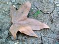
| 02/01/2005 03:37:48 AM |
Springby oracleComment by sniper: I love pictures showing fragile life springing up thru the harshest covers mother nature can supply. So, one it's a good picture and two, it's old and new. Sounds complete to me:) |
| Photographer found comment helpful. |
| 01/31/2005 02:20:55 PM |
|
| Photographer found comment helpful. |
| 01/29/2005 09:01:30 PM |
Springby oracleComment by joro: I really like this composition, and it contrasts new and old quite well. (I especially like the cracks on the ground.) I think the colors could be a bit richer (making the ground and leaf darker), and it would be more appealing to me if the tip of the leaf wasn't cut off, but I like it nonetheless. |
| Photographer found comment helpful. |
Home -
Challenges -
Community -
League -
Photos -
Cameras -
Lenses -
Learn -
Help -
Terms of Use -
Privacy -
Top ^
DPChallenge, and website content and design, Copyright © 2001-2025 Challenging Technologies, LLC.
All digital photo copyrights belong to the photographers and may not be used without permission.
Current Server Time: 03/13/2025 06:12:30 AM EDT.