| Image |
Comment |
| 08/09/2015 07:58:24 AM |
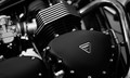
Triumphby bonnettComment by sidpixel: *Hello from Sid and the Critique Club*
A record shot that meets the challenge
The good thing about this challenge you have free reign for anything you want to do as long its duotones which your image is, therefore, it meets the challenge. The subject is one that will stir the hearts of motor cycle enthusiasts and any who admire the qualities of good engineering and an iconic name. Equally, it is a straightforward record shot and there are probably going to be a lot of voters here for whom this does not stir the same emotions.
Your exposure is good with good detail retained throughout and you have a full and lovely range of tones from the brightest highlight surrounding the makers badge through to the deepest shadows below the carb. I like your wide open aperture it emphasises the iconic name whilst still retaining sufficient detail in the rest of the components.
Where I think you have failed to make the best of the opportunity is in your composition, I just think with a little adjustment there were probably better possibilities here, for example, I think the carb has less appeal than the beautiful curve of the exhaust. By moving the frame right and up a little to include all those lovely curves you would have had a more appealing composition, you would also have had some lovely distorted reflections too. The downside is it would have moved the logo more to the middle but the fact that it is on a slant helps alleviate that.
Thanks for sharing your lovely image, Sid |
 Photographer found comment helpful. Photographer found comment helpful. |
| 04/15/2011 08:34:56 AM |
Choicesby bonnettComment by Paul: Greetings from the Critique Club:
I think this is an exceptional image. Wonderful tones, bags of story and an intriguing compositional balance. I really like your use of negative space here and how your subject stares blankly into it. I also like how the image is black on the left, white on the right and grey in the centre - perhaps a visual clue that some choices aren't black and white and that the considered action may lead to a 'grey' outcome.
The pin sharp eye is especially well judged, providing an anchor point from which the eye can explore the rest of the image.
So much to like here. Good job all round. |
| Photographer found comment helpful. |
| 04/09/2011 11:32:28 PM |
|
| Photographer found comment helpful. |
| 04/09/2011 05:30:23 AM |
Choicesby bonnettComment by Marfun: Spot on focus, good use of available light, interesting composition. |
| Photographer found comment helpful. |
| 04/06/2011 07:45:05 PM |
|
| Photographer found comment helpful. |
| 01/07/2008 10:26:34 AM |
|
| Photographer found comment helpful. |
| 01/07/2008 05:18:00 AM |
Thoughtsby bonnettComment by SaraR: I like the idea behind the photo - a soft ronantic feel. I wish that either the tiny part of thigh in the lower left corner wasn't visible, or that the top had fallen open to reveal more skin. |
| Photographer found comment helpful. |
| 01/06/2008 10:17:12 PM |
Thoughtsby bonnettComment by FocusPoint: Nice. Good lighting. I like the softness but I prefer sharpness on the eyes area. Still, very nice job :) |
| Photographer found comment helpful. |
| 01/03/2008 01:04:31 AM |
Thoughtsby bonnettComment by Jutilda: Nice lighting and focus on her eyes. I think I would have cropped it right at the end of the tendril of hair. Might not be a traditional size, but so much white and the smocking on the blouse, is a touch distracting to me. ;~D |
| Photographer found comment helpful. |
| 01/01/2008 06:04:54 PM |
|
| Photographer found comment helpful. |
Home -
Challenges -
Community -
League -
Photos -
Cameras -
Lenses -
Learn -
Help -
Terms of Use -
Privacy -
Top ^
DPChallenge, and website content and design, Copyright © 2001-2025 Challenging Technologies, LLC.
All digital photo copyrights belong to the photographers and may not be used without permission.
Current Server Time: 04/25/2025 02:53:17 AM EDT.