DPChallenge: A Digital Photography Contest You are not logged in. (log in or register
 
Browse Settings
Currently viewing:
Registered Userfrancis1426

Show comments:

Per page:

Order:

Comments:


Comments Received by francis1426
Pages:  
Showing 1 - 10 of ~16
Image Comment
Store Closed
12/13/2005 10:25:40 AM
Store Closed
by francis1426

Comment by judy c:
nice mood, composition
Photographer found comment helpful.
Store Closed
12/11/2005 04:10:07 PM
Store Closed
by francis1426

Comment by NstiG8tr:
Focus seems to be off. I don't really like the blue cast.
Photographer found comment helpful.
Store Closed
12/10/2005 11:34:17 AM
Store Closed
by francis1426

Comment by heytonyd:
this is a very good shot. the blue of the moon and store is great. a little blurry. but a great shot. good luck.
Photographer found comment helpful.
Store Closed
12/09/2005 12:13:57 AM
Store Closed
by francis1426

Comment by SarahCJ:
Love the colors!

<3 Sarah

P.S. One of my top choices!
Photographer found comment helpful.
Store Closed
12/07/2005 03:03:18 PM
Store Closed
by francis1426

Comment by casm:
nice shot. i love the colors and light
Photographer found comment helpful.
Store Closed
12/07/2005 12:58:18 PM
Store Closed
by francis1426

Comment by ThomLee:
Nice photo, but without the title, I'd never guess that this image had anything to do with the concept of "too late"
Photographer found comment helpful.
fragile world
11/07/2005 12:29:45 PM
fragile world
by francis1426

Comment by CEJ:
Hello from the Critique Club!

I have studied your image and have the following to offer:

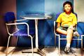
Composition/perspective - I think this is the strongest element of this image. Rule of thirds is applied well with the main subject even though the table and chairs are centered. The subject weights it to one side offsetting this nicely. Being on his eye level really makes a strong impression. This is amplified by his gaze appearng to be off to one side. The shot is not too busy and the subject is strong enough to have been placed alone in the shot (minus the extra chair and table).

Color - The colors seem very saturated. Your processing steps don't list use of this so I have to assume it is from the dodging. Possibly a bit much. There exists a nice contrast between the yellow and blue that is emphasized by the changing of the background colors.

Lighting - This looks to be natural indoor light which also appears very bright. The reflection off the table is a distraction and there appears to be some specks floating around the table/walls with some distracting flares of reflection. Again, not sure if this is caused by natural relfection or processing, but they add to the overall overbright feeling in the shot. The base stem of the table is slightly blown out as well as the yellow of the shirt, the hand on his leg.

Challenge requirements - I do not immediately get delicate from this photograph without the title. This may be one area where it failed with the viewers/voters. The subject's expression is good and perhaps a tighter zoom on the subject with a tighter crop would have helped this apsect.

Processing - this does appear to be over-processed. The disparity in the facial tones, the blown out yellow of the shirt, the artificial color of the skin in the face and legs. A little less would have made it stronger. The focus seems to be off a bit as well in the subject. This fuzzy appearance may be due to the processing as the rest of the image does not appear to be as fuzzy. This was a basic editing challenge and as such, selective editing is not allowed.

Overall/my opinion - with less processing and more atention to the lighting this would have been a stronger challenge entry. Although far away and fuzzy, his expression really makes the shot. A closer/tighter image may have helped some.

Message edited by author 2005-11-07 22:09:22.
Photographer found comment helpful.
fragile world
11/01/2005 11:08:52 AM
fragile world
by francis1426

Comment by irish_eyes:
very colorful :)
Photographer found comment helpful.
fragile world
10/30/2005 05:50:08 PM
fragile world
by francis1426

Comment by monh:
very interesting. I am strongly attracted to the pastel-like colors. The subject is positioned well in the photo. The expression on the boy's face adds a nice touch.
Photographer found comment helpful.
fragile world
10/29/2005 10:28:11 AM
fragile world
by francis1426

Comment by mandyturner:
I like the oversaturated colors in this image. I feel that you have made an impact with the colors and make this picture pop. Not sure if I would call this delicate or not, but I do like the picture.
Photographer found comment helpful.
Pages:  
Showing 1 - 10 of ~16


Home - Challenges - Community - League - Photos - Cameras - Lenses - Learn - Help - Terms of Use - Privacy - Top ^
DPChallenge, and website content and design, Copyright © 2001-2025 Challenging Technologies, LLC.
All digital photo copyrights belong to the photographers and may not be used without permission.
Current Server Time: 03/12/2025 02:34:25 PM EDT.