| Image |
Comment |
| 04/06/2010 02:17:31 PM |
Easter Blueby jerseyjimComment by K3Master: Bold move to keep the shirt saturated, as it'll probably get hit hard by the anti-desat movement that's about these days.
Personally, I would have kept the eyes saturated as well to help balance the photo out, although if they're hazel/brown/etc. it wouldn't have mattered much. In which case I would have kept the shirt B&W. There's a bit of an issue with composition balance as well, as the upper part of the photo doesn't really add much, and takes away from the feel.
Not saying, of course, that you should do these things, but that's how I feel when I look at it. |
 Photographer found comment helpful. Photographer found comment helpful. |
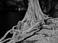
| 01/26/2009 04:17:29 PM |
Rootsby jerseyjimComment by Jessi: I love all the tones in this -- the patterns in the roots, the shadows, the water, the bright tree on the far side...
Lighting makes it look a bit flat.
(no vote) |
| Photographer found comment helpful. |
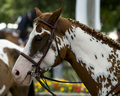
| 08/26/2008 03:58:18 PM |
Ready for My Close Upby jerseyjimComment by docurrie: A less busy background and shallower depth of field would help this shot. All the highlights in the back gound are somewhat distracting. Some nice fill flash would have helped too to get some light into the eye and give it a catch light. Try to get pictures of horses with thier ears pointing forward. |
| Photographer found comment helpful. |
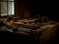
| 01/01/2008 06:39:38 PM |
The Old Carpenter's Benchby jerseyjimComment by Tammer: I'm curious as to how this would look in sepia tone - if it would give it an even greater "old-time" feel? I like the composition. For me, I wish there was just a tad bit more light. |
| Photographer found comment helpful. |
| 01/01/2008 06:11:57 AM |
|
| Photographer found comment helpful. |
| 12/31/2007 05:38:21 AM |
|
| Photographer found comment helpful. |
| 12/31/2007 12:12:13 AM |
|
| Photographer found comment helpful. |
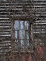
| 12/20/2007 11:04:26 AM |
Window in Timeby jerseyjimComment by Chinarosepetal: You've spotted something good here and the lighting and focus are good too. I think it would be worth playing around with the composition too - shifting the window to the lower left maybe :) |
| Photographer found comment helpful. |
| 12/19/2007 05:56:09 PM |
Window in Timeby jerseyjimComment by KarenNfld: Did you try cropping so the window wasn't so centered? I love this as is but I think I might love it a bit more if the window wasn't in the center. |
| Photographer found comment helpful. |
| 12/19/2007 03:20:47 PM |
|
| Photographer found comment helpful. |
Home -
Challenges -
Community -
League -
Photos -
Cameras -
Lenses -
Learn -
Help -
Terms of Use -
Privacy -
Top ^
DPChallenge, and website content and design, Copyright © 2001-2025 Challenging Technologies, LLC.
All digital photo copyrights belong to the photographers and may not be used without permission.
Current Server Time: 04/01/2025 05:08:13 AM EDT.