| Image |
Comment |
| 06/22/2006 07:57:32 PM |
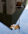
Barbedby vjozComment by cdownie: I would have liked to see more of the in focus leaves in the frame |
 Photographer found comment helpful. Photographer found comment helpful. |
| 06/21/2006 01:10:22 AM |
Barbedby vjozComment by Tej: This had been a cliche is the wire was in focus... but keeping it as bokeh adds new punch to it. Hope this does well for you.9. |
| Photographer found comment helpful. |
| 06/06/2006 01:33:43 PM |
Subtle Architectureby vjozComment by fotomann_forever: ::: Greetings from Critique Club :::
Hi, as requested, here is an indepth critique of your submission.
First Impression - the most important one:
Interesting shot, but comes off a bit too abstract for an architecture shot.
Composition:
I like the composition. It's unique and strong.
Subject:
OK, here's where I get a bit confused. The subject here is the leaf, which stands out strong against the background. However, you are entering into a challenge on architecture. Hence, I believe a deeper DoF is needed to have the building a bit more in focus. The funny thing about reflections is that you must add more DoF to have them in focus (the distance from reflector to what is being reflected is important in your DoF choice).
Technical (Color, focus, and light):
I think all technicals are good, other than the DoF issue I just talked about.
To grow its vote?:
I think if we could emphasize the building more with a deeper DoF the score would have been a LOT higher. I had to look for quite a bit to see the building. Voters don't generally give you that luxury.
Summary:
It was a creative take on the challenge and I hate to see it got bashed in voting.
Hope to see more from you soon,
Leroy |
| Photographer found comment helpful. |
| 06/02/2006 09:35:10 AM |
|
| Photographer found comment helpful. |
| 05/11/2004 09:24:56 AM |
by vjozComment by mannjudit: The idea is very good, but the composition is somewhat one-sided. I understand that you wanted someting special, but that big blurred area occupying the most emphasized place of the picture is not a lucky solution |
| Photographer found comment helpful. |
| 05/10/2004 11:03:53 AM |
by vjozComment by autool: Composition: Subject Placement, Cropping, Background 5
Technical: Focus, Exposure, Lighting, Processing 7
Appeal: Is it Interesting, Motivating, Etc.? 5
How well does it meet the challenge: 8
Total Averaged Rating 6.25 Dick
You offset it just toooo much. |
| Photographer found comment helpful. |
| 05/09/2004 09:11:53 PM |
by vjozComment by orussell: Composition: Subject Placement, Cropping, Background 6
Technical: Focus, Exposure, Lighting, Processing 5
Appeal: Is it Interesting, Motivating, Etc. 5
How well does it meet the challenge: 7
Total Averaged Rating(Rounded) 6
|
| Photographer found comment helpful. |
| 05/05/2004 12:38:00 PM |
by vjozComment by skief: 2 picky things on this interesting photo, first is the dark spot at the top, second is the blue ?ball? towards the bottom. Pic would be better without either. |
| Photographer found comment helpful. |
| 01/11/2004 06:56:57 PM |
|
| Photographer found comment helpful. |
| 01/09/2004 02:39:44 AM |
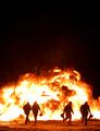
Fire in the blizzardby vjozComment by Alexys: Good image. I like the use of negative space in your space. Furthermore, the men siluettes adds more intereresting to the picture. Definitely, congrats for a good work. |
| Photographer found comment helpful. |
Home -
Challenges -
Community -
League -
Photos -
Cameras -
Lenses -
Learn -
Help -
Terms of Use -
Privacy -
Top ^
DPChallenge, and website content and design, Copyright © 2001-2025 Challenging Technologies, LLC.
All digital photo copyrights belong to the photographers and may not be used without permission.
Current Server Time: 03/12/2025 09:25:23 AM EDT.