| Image |
Comment |
| 05/12/2007 09:56:32 AM |
|
 Photographer found comment helpful. Photographer found comment helpful. |
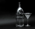
| 05/11/2007 06:19:16 PM |
Just What I Needby LiehscComment by sfalice: Greetings from the Critique Club
Now there's a man who likes his vodka martinis!
Very nice light to dark shades in this black & white image. And I very much like the way you used the black paper to curve around the background. It looks seamless and professional.
If it was mine, I'd probably try to control the ambient lighting a bit more. As some of your commentors said, the room is well represented in the bottle. Another way around the ambient light problem might be to frost the bottle as you have the glass. Might be messy, but might be interesting.
As far as composition goes, while I like the off-center position of the bottle and glass (the glass is VERY well done, by the way) I'm not sure why the items are offset. I think the left side of this very nice image could use a bit more punch. For example, if the gentle streak of light caused by the curve in the black paper were brighter, it might lead the viewer to the main attraction.
Okay, that's your 2¢ from this Critique Club member. And I do wish you much success in DPC. |
| Photographer found comment helpful. |
| 05/07/2007 06:13:08 PM |
Just What I Needby LiehscComment by Ann: Glass is so hard to shoot! You've done a pretty nice job of capturing a difficult subject with minimal equipment. Next time, you might try hanging a sheet up in front of the glass, so that the whole room doesn't show up reflected in the bottle. But it is a good job getting the bottle to stand out from the background. That's hard to do. |
| Photographer found comment helpful. |
| 05/03/2007 02:36:10 PM |
As Life Goes Byby LiehscComment by bucket: everything you could want in a shot is in his eyes...a beautiful pause in my day, perfectly gentle... |
| Photographer found comment helpful. |
| 05/03/2007 12:37:31 AM |
|
| Photographer found comment helpful. |
| 05/01/2007 10:19:17 AM |
Just What I Needby LiehscComment by Jutilda: Nice stock photo. Great lighting and focus. Maybe not enough WOW for a Free Study, but a good solid image. |
| Photographer found comment helpful. |
| 05/01/2007 09:09:27 AM |
|
| Photographer found comment helpful. |
| 04/28/2007 07:41:17 PM |
Train Rideby LiehscComment by Sting11165: (copied from forum post)
Nice silhouette -- this is a type of image that I've never really done before but am looking forward to it. It clearly tells a story (boy looking at train) without clearly showing the boy or train. Good sharpness, good contrast. Good selective focus on the boy (it would lose the dreamy quality if the train was sharp, I think). After all, the subject of the photo is the boy.
Definitely like the desaturation in this one. I'm not sure it'd work in color.
Composition is good, although I'd like to see a tighter crop to make the image a bit more 'intimate'. Really draw the viewer in to the boy. You could crop out the white space above the train easily, you might even be able to crop out the top half of the train and still keep the idea (probably not though, now that I think about it). A lower vantage point might help, if you could take it again, to get tight with the boy yet clearly show the train.
That's about it -- a nice image.
Oh, one other thought -- would it be cool if you could get some motion blur on the train? Good luck getting the kid to sit still though :) |
| Photographer found comment helpful. |
| 04/26/2007 06:17:08 PM |
Pinkby LiehscComment by Techo: This is quite the nice bouqet. I wouldn't mind a crop off the bottom to hide the vase. And you can always add a bit of black empty space at the top to keep the aspect ratio. The Color Balance seems off a bit, too much red. But I don't quite mind it here. Your call. |
| Photographer found comment helpful. |
| 04/26/2007 04:03:18 PM |
|
| Photographer found comment helpful. |
Home -
Challenges -
Community -
League -
Photos -
Cameras -
Lenses -
Learn -
Help -
Terms of Use -
Privacy -
Top ^
DPChallenge, and website content and design, Copyright © 2001-2025 Challenging Technologies, LLC.
All digital photo copyrights belong to the photographers and may not be used without permission.
Current Server Time: 04/25/2025 08:58:08 AM EDT.