| Image |
Comment |
| 06/05/2007 02:56:08 PM |
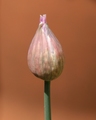
Chiveby CoinCounterComment by Frankie_Lv: Hello Alessio,
Two things stick out here, fill flash to eleminate the shadows & a darker background. The darker BG would have helped make your subject more pronounced. Also some saturation of your colors (stem) would have helped. |
 Photographer found comment helpful. Photographer found comment helpful. |
| 05/25/2007 03:32:21 PM |
Chiveby CoinCounterComment by boxImmortal: Simple and pretty. Could maybe be improved by bumping up the saturation (esp. the green on the stem) just a bit. |
| Photographer found comment helpful. |
| 05/24/2007 03:50:18 PM |
Chiveby CoinCounterComment by glad2badad: It's a nice shape, but a little (sorry) uninteresting. Good luck in the challenge.
BTW - Commented only, not voting. |
| Photographer found comment helpful. |
| 05/23/2007 06:23:12 AM |
Chiveby CoinCounterComment by HighNooner: Usually I do not like objects floating in a picture’s composition without an anchor point; yours has an anchor point which is the stem; and in this case I would prefer to see it much weaker to give a floating feel to the nice shape you have captured.
The harsh light and shadow cast on the stem is taking attraction from the shape especially with non-contrasting color of the background, and the right bottom side is under lit.
The color saturation feels a tad under. |
| Photographer found comment helpful. |
Home -
Challenges -
Community -
League -
Photos -
Cameras -
Lenses -
Learn -
Help -
Terms of Use -
Privacy -
Top ^
DPChallenge, and website content and design, Copyright © 2001-2025 Challenging Technologies, LLC.
All digital photo copyrights belong to the photographers and may not be used without permission.
Current Server Time: 03/11/2025 01:37:43 PM EDT.