| Image |
Comment |
| 10/07/2010 10:32:28 PM |
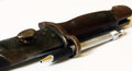
The pen is mightierby andresedComment by giantmike: Fun and cool take on this challenge. I am finding myself not liking the white in this photo, I think it detracts from the old look of the sword somehow. |
 Photographer found comment helpful. Photographer found comment helpful. |
| 10/06/2010 03:04:55 PM |
|
| Photographer found comment helpful. |
| 10/01/2010 11:57:44 AM |
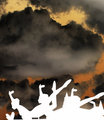
Sky Dancersby andresedComment by atupdate: Back to comment: The building in the background really takes away from the shape of the statues. I'm sure you choose this perspective because of the building but there is way too much sky, which makes the composition look unbalanced. |
| Photographer found comment helpful. |
| 09/29/2010 09:40:32 PM |
|
| Photographer found comment helpful. |
| 09/29/2010 12:41:47 PM |
Sky Dancersby andresedComment by tanguera: Very interesting combination of realism and graphic. Clearly, the figures were completely silhouetted. The image is very powerful, but the contrast doesn't work that well for me. It's just a matter of taste, since it is clearly a fabulous picture. |
| Photographer found comment helpful. |
Home -
Challenges -
Community -
League -
Photos -
Cameras -
Lenses -
Learn -
Help -
Terms of Use -
Privacy -
Top ^
DPChallenge, and website content and design, Copyright © 2001-2025 Challenging Technologies, LLC.
All digital photo copyrights belong to the photographers and may not be used without permission.
Current Server Time: 03/11/2025 01:03:48 PM EDT.