| Image |
Comment |
| 12/09/2003 12:34:42 AM |
New Life, New Father, New Loveby SonifoComment: This shot brings tears to my eyes (happy ones). I can picture my husband doing the same with my son. You touch people with your photos. |
 Photographer found comment helpful. Photographer found comment helpful. |
| 12/08/2003 11:56:40 PM |
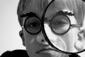
Joshuaby deemerComment: I quite don't know what to make of this shot. The magnifying glass doesn't really add much to the image, since it didn't actually magnify anything. It just looks like it's in the way of showing the silly glasses. The expression in the boy's face has no emotion, so it is not very fun to look at. Could use some overall sharpening as well. |
| Photographer found comment helpful. |
| 12/08/2003 11:53:12 PM |
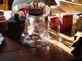
THE SHAPE OF DAYS GONE BYby ANTHONYComment: You have too many things happening in your shot. The backlighting is interesting, but the image is so busy that the viewer doesn't know what to make of it. Perhaps simplifying or different arrangement of the objects could improve your image. Also you could use the cloning tool to clean up some of the specs on the glass (legal in this case). |
| Photographer found comment helpful. |
| 12/08/2003 11:50:25 PM |
My Favorite Shapeby Chilly0999Comment: This image has a lot of potential, but it has few bugs that could be improved upon. The grain here is on purpose I guess, but it kind of kills the shape. Also it apears too horizontal. Perhaps positioning the body on an angle with just the bikini and legs showing to make it more abstract flow of shapes. Also since we are alowed to spot edit this challenge, you could have cloned out the specs on the bottom of the right leg. Great effort. |
| Photographer found comment helpful. |
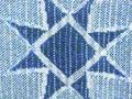
| 12/08/2003 11:43:13 PM |
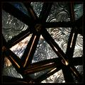
Abstract Starby mariomelComment: This photo looks very busy to me. Maybe isolating one or two of the triangles could have helped to simplify it enough to stand out in terms of shape and composition. The way it is now, it's hard to find a spot to rest your eyes on. It's not abstract enough, but I cannot guess what it is at all. |
| Photographer found comment helpful. |
| 12/08/2003 11:33:40 PM |
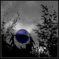
Sphere and Fractalsby GeneralEComment: Very dramatic photo. But IMO you went a bit too far in the post processing with this. Sometimes less is more. The blue ball stands out nicely against the dramatic surroundings, but it is almost distorted by pixelation. The colour looks strange (the greenish part). I've seen fractals before, but in your image I cannot really make the connection - it looks more like chaos (fractals are highly organized). Overall, not bad image, it caught enough of my attention. |
| Photographer found comment helpful. |
| 12/08/2003 11:30:10 PM |
Ordinary Shelves in a New Lightby jaimeegrlComment: Interesting concept. Great colour contrasts. But my eyes are going around the blurry area in the centre a bit. Did you try to soften this on purpose? It could have worked all sharp as well. Also I am not too keen on centred composition. |
| Photographer found comment helpful. |
| 12/08/2003 11:27:51 PM |
Shapesby Crafty SueComment: Challenge met, you got a shape. But the image is out of focus (you got too close to it and your camera probably cannot focus in such a small distance from your object). Also give your shape more space around so it can stand out. Did you try to blow this up? It looks pixelated. Colour is nice. |
| Photographer found comment helpful. |
| 12/08/2003 11:25:21 PM |
Too Tallby ImablessedComment: You will probably get many comments on the yellow text over your image. It is really oooops you should try to avoid. You could have edit it out in this challenge (it was legal). The object is interesting, but has way too much space around it for it to really stand out. I would suggest moving closer or zooming in a bit towards the top. Image could also use a bit of brightening. |
| Photographer found comment helpful. |
| 12/08/2003 11:23:17 PM |
Natural Reflectionsby JC_HomolaComment: I am trying really hard, but I do not see the reflections you mention in your title. It looks a bit underexposed and has a yellowish cast. The shape itself is nice, but the image as a whole is not interesting enough for the shape to make any impact. |
| Photographer found comment helpful. |
Home -
Challenges -
Community -
League -
Photos -
Cameras -
Lenses -
Learn -
Help -
Terms of Use -
Privacy -
Top ^
DPChallenge, and website content and design, Copyright © 2001-2025 Challenging Technologies, LLC.
All digital photo copyrights belong to the photographers and may not be used without permission.
Current Server Time: 04/22/2025 10:14:45 PM EDT.