| Image |
Comment |
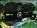
| 05/26/2009 06:38:10 AM |
My Baby - Infiniti G35xSby MisterMarcusComment: Personally, it would have worked better for me if it wasn't flipped upside down, and left right side up. For me the distortion of the reflection (top right of the image) is distracting and "plays visual tricks" with the viewer, where my first reaction is "what's wrong with this picture" vs left right side up, my first reaction would be "wow, he/she has an almost perfect reflection." But that's just my humble opinion. Good luck. |
 Photographer found comment helpful. Photographer found comment helpful. |
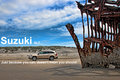
| 05/26/2009 06:23:27 AM |
Suzuki XL7by aliquiComment: I personally don't get the tag line, but I'm not judging the tag line or font. With that said, I do like how you placed the text over and under the vehicle. This technique further draws the viewer's attention to the vehicle. Nice job there. I like the composition, the vehicle looks nicely focused. In my opinion, I like the "balance" of the image with the shipwreck, the vehicle and dunes and even the sky. I think the clouds give the sky "balance" to the ship. I think this is nicely done. |
| Photographer found comment helpful. |
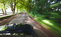
| 05/26/2009 06:12:48 AM |
Let BMW move youby bob_bobskiComment: Great motion, but not enough car. Image needs more of the car and someway to show its a BMW. As is, the only thing that the average viewer can tell its a BMW is the title. IMHO. |
| Photographer found comment helpful. |
| 05/26/2009 06:08:51 AM |
BMW - You'll Know When You Get Thereby k9logicComment: Composition is off (for me). In general, I think it would have worked better to compose the BMW more to the left, going into the frame vs leaving the frame. I'm sure it was an artistic decision to have the sun directly in the background, but I think it hurts more than helps the image. It creates glare that detracts from the vehicle. But thats just my opinion. |
| Photographer found comment helpful. |
| 05/25/2009 05:06:44 PM |
Ford Taurusby XMountaineerComment: Composition is off, the car is pointed to the left leaving all that dead space to the right. The signage in the background is distracting, doesn't add to the image. The image/car's front end is too dark (could be the camera is metering off of the turned on head lights.) I think the image would have work better if you had moved the car to the right of your setup getting the parking level sign out of the image. Recompose the image using rule of thirds so that car is leading into the frame instead of exiting the frame. Just my honest critique. |
| Photographer found comment helpful. |
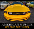
| 05/25/2009 04:54:54 PM |
American Muscle — Roush Performance Products Mustangby Bear_MusicComment: Nice classic image of a muscle car, nice and tight crop, brilliant color, crisp focus. Only detractor for me are the cars in the background. If you could have gotten a shot of the Mustang with nothing in the background, it would have helped. Good luck. |
| Photographer found comment helpful. |
| 05/25/2009 04:31:50 PM |
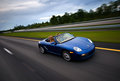
Porsche.....Every Ride Is An Adventureby senor_kasperComment: Nice shot, the car is crisp/focused. The blue of the car "pops." Well done conveyance of motion. However, I think it would have worked better if the car was more to the left (using the rule of thirds). IMO. |
| Photographer found comment helpful. |
| 05/25/2009 04:22:29 PM |
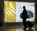
Musingby LevTComment: I get the concept, nice idea. However, I think it would have worked better if the guy was to the left another four to five feet (in front of the yellow pattern) so that the image of the BMW was not blocked. This looks like an opportunity shot; maybe you could have gotten a friend to walk by the billboard and turn his/her head back looking at the BMW to duplicate the concept??? Anyways, good concept, just the composition is "off." IMHO. |
| Photographer found comment helpful. |
| 05/25/2009 04:14:10 PM |
VERSA-tilityby PennyStreetComment: Nice and crisp. However, the rear of the car is cropped out, would have been better if the back wasn't cut off. I would have liked the side of the car lightened up a bit (if possible) to be able to see details of the car. Just my honest critique. |
| Photographer found comment helpful. |
| 05/25/2009 04:00:50 PM |
|
| Photographer found comment helpful. |
Home -
Challenges -
Community -
League -
Photos -
Cameras -
Lenses -
Learn -
Help -
Terms of Use -
Privacy -
Top ^
DPChallenge, and website content and design, Copyright © 2001-2025 Challenging Technologies, LLC.
All digital photo copyrights belong to the photographers and may not be used without permission.
Current Server Time: 04/07/2025 12:07:23 AM EDT.