| Image |
Comment |
| 03/15/2013 07:11:36 AM |
baseballby FourPointXComment: critique club.
great composition. the leading lines from the wires, the circular shape of stands, the angles from the baselines and grass cuts. superb.
the colors are a bit over the top, the sky is dark and haloing around the clouds is distracting and it just looks unnatural.
i'd love to see you take another shot at the edit of this because it really has some fantastic elements. |
 Photographer found comment helpful. Photographer found comment helpful. |
| 03/15/2013 07:06:59 AM |
Brothersby enikoComment: critique club.
great emotion.
technically the image is a bit soft where it ought to be harder, i also wish the brother on the left were better exposed as his expression is lost in the shadows.
DOF seems way to shallow, the brother on the right is nice and sharp whereas the one on the left is a bit OOF. |
| Photographer found comment helpful. |
| 03/15/2013 07:04:13 AM |
B is for Bendingby HoghemaruComment: critique club.
i forget what i voted this image in voting but i remember scoring it high, great DOF simple, effective. i only wish for the focus to be a bit more on the fingers, its seem slightly in front of them.
also maybe a a bit more of the neck leading up to the hand to really draw the viewer in.
|
| Photographer found comment helpful. |
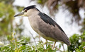
| 03/15/2013 06:49:25 AM |
B is for "Bird" - Black-Crowned Night Heronby Ja-9Comment: critique club
i don't know what the other commenters see but honestly ,to me, this is boring, its a picture of a bird, dead center, lighting inst interesting, color isn't interesting, no textures or interesting backgrounds.
sorry to be blunt but i don't see the point in this image besides wanting to enter something in this challenge.
|
| Photographer found comment helpful. |
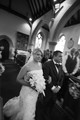
| 03/15/2013 06:44:07 AM |
B is for Brideby acg83Comment: critique club.
let me guess, center point focus on the brides face. as a result you have too much of nothing at the top and not enough of interesting at the bottom. the blur is also very distracting.
i would also prefer you to have been a bit lower, looking up slighting at the bridge and letting her dominate the frame.
i think you ought to try to crop in a bit and remove a lot of the distracting elements. |
| Photographer found comment helpful. |
| 03/15/2013 06:39:06 AM |
A Boat Between A Bridgeby jaysonmcComment: critique club
the image has too many competing elements and the only thing to draw me to the boat was the title. this image lacks a clear focal point.
tone wise its fantastic, lots of depth and texture, its pleasing to look at, its just not showing me anything. |
| Photographer found comment helpful. |
| 03/15/2013 06:32:38 AM |
Boats on a Beachby AV8RComment: critique club:
clearly the voters liked it, i didn't, the colors are great especially that golden sun, the lighting on the boats picks up the texture perfectly.
the composition is really bugging me, the house is just falling off the left side. the sign is halfway cut off, it just feels incomplete. you have lots of great little elements that stand out on their own, the boats, the light, the background sky, but in this case they don't seem to work well all together, and i think the house is the reason |
| Photographer found comment helpful. |
| 03/15/2013 06:28:20 AM |
Buddiesby ankursomaniComment: critique club
cute picture. as with most pictures of kids who aren't mine there's not much to hold my attention besides that.
technical: the eyes are a little dark, i like to see big bright lit up eyes with bold catch lights if possible. based on the shadows on the next the light was directly from the front and overhead, that doesn't always make the most compelling portrait lighting. |
| Photographer found comment helpful. |
| 03/15/2013 06:23:18 AM |
snow roseby posthumousComment: critique club
i don't like this image. the tungsten color cast isn't pleasing, the shadow on the right is attempting to capture my attention.
i admire the attempt at simplicity, it needs better lighting, too many competing elements take away from the what you are attempting to show based on your description.
|
| Photographer found comment helpful. |
| 03/15/2013 06:19:30 AM |
Alabasterby Ja-9Comment: critique club:
clearly you followed the established the composition rules, its works well however its lacking depth in the texture. the color fading out to white works well, but as i said earlier i want to feel the texture of the flower and i cant.
of course it minimal editing so you couldn't do much. I'd love to see this processed. you did as best you could within your limits. |
| Photographer found comment helpful. |
Home -
Challenges -
Community -
League -
Photos -
Cameras -
Lenses -
Learn -
Help -
Terms of Use -
Privacy -
Top ^
DPChallenge, and website content and design, Copyright © 2001-2025 Challenging Technologies, LLC.
All digital photo copyrights belong to the photographers and may not be used without permission.
Current Server Time: 04/22/2025 12:18:25 PM EDT.