| Image |
Comment |
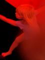
| 10/09/2003 11:24:53 PM |
Untitledby GraciousComment: I wish you had a title with this so I could get a better idea of what you were aiming for. I'm guessing a child escaping from a fire hence the red and smoke effect? The blurriness of the shot adds to the nightmare aspect but also distracts at the same time, overall a good effort. |
 Photographer found comment helpful. Photographer found comment helpful. |
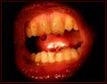
| 10/09/2003 11:20:40 PM |
Demon Screamby sly_tComment: Ewwwwwwwwwwwwww! :) Is that vaseline? I bet it was a bit fun doing this shot for you but not for your model, LOL!
As for the shot itself, if the lips were more defined, possibly redder I would probably like this shot much more and it would convey even a more nightmarish image to me. |
| Photographer found comment helpful. |
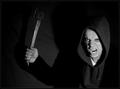
| 10/09/2003 11:18:14 PM |
Welcome to my Nightmareby heidaComment: EEK! That's not a very nice looking man but then again he's not supposed to be, right? LOL The shot itself seemed off balance when I first saw it and when I came back to it I looked to see why I felt that, it's not the balance between the man and the axe but the balance of light that threw me at first. The man is brighter and from the shadows I'm buessing the light was to the slight side of him, I think if the axe shadow was more defined I'd score this very high |
| Photographer found comment helpful. |
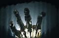
| 10/09/2003 11:15:31 PM |
What I see when I'm drowningby JC_HomolaComment: This is an interesting shot, I'm trying to figure out if it's actually underwater or through glass, can't wait to find out. As for the shot itself, the light coming through the upper palm of the hand is rather distracting and I think it might have worked better if it wasn't quite as bright or if it's to represent the sun could have been more to the side or through the fingers because coming so bright through the hand it should have been more red. |
| Photographer found comment helpful. |
| 10/09/2003 11:12:38 PM |
A Parent's Nightmareby BeagleboyComment: Yes it could be. The overall shot is well done, good light, contrast and showing the indifference of society at times. |
| Photographer found comment helpful. |
| 10/09/2003 11:06:55 PM |
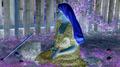
Displaced Wonderlandby LucidLotusComment: I'm guessing you were going for Alice in Wonderland in reverse here therefore using an older model instead of someone closer to the image of Alice. Nice touch and the coloring really takes you into another world. At first glance this picture was a bit disturbing to me but upon a second, closer look I see more of what you might have been going for and like the image you projected. |
| Photographer found comment helpful. |
| 10/09/2003 11:04:54 PM |
"Technicolor Dreams"by BitzComment: Disjointed, must like dreams but I think a soft focus would have worked much better on this, also if you could have made the items seem suspended, more surreal. |
| Photographer found comment helpful. |
| 10/09/2003 11:03:41 PM |
Dreaming at work = A big nightmare.by cimarron98Comment: I understand where you were going with this shot and it probably would have worked except for two things, the legs on the left, indicating that someone else is in the shot but just sitting there? And the subject themselves do not look like they are dreaming or relaxing enough to be sleeping at work and dreaming, they look more like they are possibly crying or just putting their heads down like a child might at school. |
| Photographer found comment helpful. |
| 10/09/2003 10:51:24 PM |
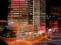
The colors of the nightby AmielComment: Wonderful colors and the clarity is amazing. One of the best night shots I've seen yet. At first I was a bit put off by the darkness in the upper right corner but upon closer examination the different colors and contrasts really help make the picture. |
| Photographer found comment helpful. |
| 10/09/2003 10:46:34 PM |
|
| Photographer found comment helpful. |
Home -
Challenges -
Community -
League -
Photos -
Cameras -
Lenses -
Learn -
Help -
Terms of Use -
Privacy -
Top ^
DPChallenge, and website content and design, Copyright © 2001-2025 Challenging Technologies, LLC.
All digital photo copyrights belong to the photographers and may not be used without permission.
Current Server Time: 04/21/2025 06:02:26 AM EDT.