| Image |
Comment |
| 10/09/2003 10:44:20 AM |
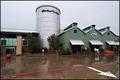
Market in Fall Rainby DennisFComment: Rural urban is the sense I get from this picture. I like that but the aspect of it, the angle is throwing me a bit but not in a bad way. The big white arrow on the right draws too much attention away from the buildings but at the same time makes you look at the overall picture. |
 Photographer found comment helpful. Photographer found comment helpful. |
| 10/09/2003 10:41:39 AM |
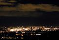
Gothenburg By Nightby MikaelComment: This is scoring low for me simply because the focus is way off, it's just a blur of lights to me, not a lot of definition and the balance between the sky and town is off. Too much negative space for this challenge. |
| Photographer found comment helpful. |
| 10/09/2003 10:35:22 AM |
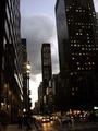
Night N Dayby OOsirisComment: This shot originally scored very low with me and upon second appraisal I will be raising my score but only by a few points. The angle of the shot really throws me and it if was a bit more level I probably would have liked it much better. The focus is too soft , more sharpness would have really worked on this for me. The sense of the challenge was met without a doubt, really conveys that sense of urban. |
| Photographer found comment helpful. |
| 10/09/2003 10:30:04 AM |
Nature Retakesby CraigDComment: At first glance I thought you had gone for the nature landscape despite the title! But upon a second and closer look I now really see the building in the background and how it appears that it's being taken over by the tree but the ratios are slightly off, which actually adds to the picture for me. I am raising my original score but it could have been much higher if you had possibly cropped a little differently, brought the building in tighter, cutting out the right side would have worked for me, drawing more attention to the tree on the left |
| Photographer found comment helpful. |
| 10/09/2003 10:26:02 AM |
Urban Boatby anirenoComment: This originally scored very low for me, it just didn't grab me at first glance but upon a second look I think it was the angle of the shot that originally threw me off. I see exactly what you mean by Urban Boat, it does look the bow of a ship. The antennea on the top adds the smokestack effect, very nice. The lighting and colors are excellent, this score goes way up on a second look. |
| Photographer found comment helpful. |
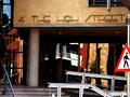
| 10/09/2003 10:23:41 AM |
Why is Harry Happy?by dhelmanComment: I don't know why! :)
The lines on this photo help draw your attention accross the picture, which I do like but the lighting seems to be off. I'm guessing the store itself was in the shadows? And it seems just a bit grainy on my monitor. |
| Photographer found comment helpful. |
| 10/09/2003 10:21:22 AM |
Reflections from number 4by GinaRothfelsComment: This is a very busy photo, so many things going on, so many things trying to draw your attention in, the hand rails going in all different directions offset by the straight lines of the building. Excellent capture of the chaos that can come from the urban area. The reflections really did throw me off at first but upon a second, longer look I see how they again, help convey the sense of chaos and busy aspect of the photo. Raising the score on this one for sure! |
| Photographer found comment helpful. |
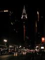
| 10/09/2003 09:48:36 AM |
Chrysler Building in NYCby SchmalComment: Overall a good concept and does convey a sense of urban but all the darkness in the middle (and my monitor has been readjusted so the darkest pictures are much better) really throws me off. It's almost as if the picture got cut in half. Maybe if you had focused more in ont he NAiLS/McDonalds building to the right I would have found this much more interesting. |
| Photographer found comment helpful. |
| 10/09/2003 09:46:01 AM |
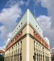
Federal Buildingsby GeneralEComment: I do get the sense of urban but don't really like the effects you did to the picture. And possibly if you had focused more on the buildings instead of the street I could have scored much higher. |
| Photographer found comment helpful. |
| 10/09/2003 09:44:30 AM |
Tallinnby zummerComment: Nice use of negative space but too much for my taste for this challenge. If you had focused more on the buildings I think the sense of urban would have come through much better. Otherwise it's a lovely shot, good color, crisp, clear and appealing. |
| Photographer found comment helpful. |
Home -
Challenges -
Community -
League -
Photos -
Cameras -
Lenses -
Learn -
Help -
Terms of Use -
Privacy -
Top ^
DPChallenge, and website content and design, Copyright © 2001-2025 Challenging Technologies, LLC.
All digital photo copyrights belong to the photographers and may not be used without permission.
Current Server Time: 04/18/2025 01:17:05 PM EDT.