| Image |
Comment |
| 10/09/2003 09:39:32 AM |
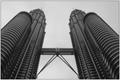
The Two Towersby Adrian TungComment: Nice perspective of the towers. Looks like they are about to tumble on top of you! This does meet the challenge very well in my book but the overall shading, contrast of the picture seems just slightly off to me. |
 Photographer found comment helpful. Photographer found comment helpful. |
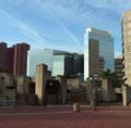
| 10/09/2003 09:38:10 AM |
The Webby RockComment: WOW! This would have been great for the repitition contest! The sun reflecting off the glass is a great effect and I really like the way it draws you up but it also throws me off balance which can be a good thing! |
| Photographer found comment helpful. |
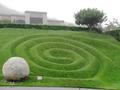
| 10/09/2003 09:33:20 AM |
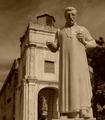
Journey back to the pastby shadowComment: I understand the coloring from your title but I think I would have liked this shot better in it's original colors. The shot itself if well cropped, the statue "looking" down is very appealing and the building behind conveys a very strong sense of urban to me. |
| Photographer found comment helpful. |
| 10/09/2003 09:32:53 AM |
dirtyby JenHallComment: I think I understand where you were trying to go with this, the grittiness, dirty side of urban living? Nice concept but the picture itself really throws me off. The lines draw your eyes out to the edges but I feel if the background, the landscape itself was just slightly more defined it might have score higher with me. |
| Photographer found comment helpful. |
| 10/09/2003 09:32:15 AM |
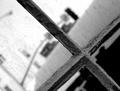
View of a rainy afternoon window...by TavaszkaComment: I could not score this one very high because I feel it was too dark, not enough contrast for my taste for the overall picture. As for meeting the challenge, this does convey a great sense of urban to me
Ammedment: After readjusting the contrast and brightness on my monitor, I find this wasn't as dark as I originally thought and can now see more of the details. Still a bit dark overall but the score does go up. I like the framing too and the overall sense of grittiness in the shot. Well done. |
| Photographer found comment helpful. |
| 10/08/2003 08:38:28 PM |
Industrializationby karmatComment: Nice factory shot but for this challenge maybe you could have focused more on one part of it, conveying the clutter and grittiness of the area? The contrasting is good though I probably would have scored a little higher if slightly brighter. |
| Photographer found comment helpful. |
| 10/08/2003 08:36:58 PM |
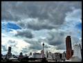
How high can we get?by zerocusaComment: Good question! Nice cloud formations but the colors in the buildings seem off to me for some reason and the balance is just slightly off, maybe just a touch more building and a little bit less sky it would have seem more balanced to me. |
| Photographer found comment helpful. |
| 10/08/2003 08:35:33 PM |
From the beginningby cielo_vieyraComment: Nice landscape shot, a bit small and doesn't really convey a sense of urban to me. Maybe if you could have gotten more centered on it and higher so more of the building on the top was showing? |
| Photographer found comment helpful. |
| 10/08/2003 08:32:39 PM |
Just one more turn!by tolovemoonComment: I think if you could have gotten out of the car and taken a still shot of the area I think it would have much better. The dash board is very distracting and throws the balance of the entire picture off for me. |
| Photographer found comment helpful. |
| 10/08/2003 08:30:49 PM |
Blue Skies over Red Bricksby coolharComment: This looks so familier to me but I can't quite place my finger on it. I like the sense of balance in the picture, the title is fitting but I think I would have gotten a better sense of urban with a little less of the red brick. |
| Photographer found comment helpful. |
Home -
Challenges -
Community -
League -
Photos -
Cameras -
Lenses -
Learn -
Help -
Terms of Use -
Privacy -
Top ^
DPChallenge, and website content and design, Copyright © 2001-2025 Challenging Technologies, LLC.
All digital photo copyrights belong to the photographers and may not be used without permission.
Current Server Time: 04/11/2025 09:58:58 AM EDT.