|
|
|
Showing 291 - 300 of ~1591 |
| Image |
Comment |
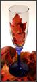
| 11/12/2005 02:48:18 AM | A Toast to Fallby Buckeye_FanComment: Greetings from the Critique Club!
What a lovely idea for the shot and a very nice overall set up. I really like the idea of the leaves in the glass and the glass on the leaves. They compliment each other that way.
Looking at the shot the first things that jump out at me is the contrast between the background (nice and white) and inside the glass near the leaves (lots of gray tones). Not sure if that's the glass or the light going through the glass. If the color inside the glass area was as white as the background, showing only the borders I'm betting this would have jumped at least another point. And if the entire glass was clear, with no blue on the bottom, really showing the leaves all the way through, top to bottom. The blue is nice but doesn't really work with the colors you have presented. This was an advanced editing so you could change the color of the upper part of the glass so it's as white as the background. If you do play with this at all and change that I would love to see the results, I bet it would be stunning overall.
I like your work so far, you've been improving right along and I can't wait to see more of your work in the future.
Hope my comments help and good luck in future challenges.
Deannda |  Photographer found comment helpful. Photographer found comment helpful. |
| 11/12/2005 02:42:31 AM | brook waterby dragonladyComment: Greetings from the Critique Club.
First, please notice the time on this, so if there are typos that I miss, please forgive me, my son is up sick so I'm killing time until he goes back to sleep.
This is a wonderful overall image. The colors, the light, the way it plays on the s leaves. I can see the swirl of water towards the bottom middle and it really catches my eye. The air bubbles on the leaves are just another great detail in the shot.
So why didn't it do better? I looked at the overall score and while nothing to be ashamed of, I quite frankly feel you were robbed! :)
My best guess is, and it is just that, a guess, that while the title tells us what the transparency is, it's not overly visable in the shot itself. I can see the effect of the water and I can see the bubbles of the trapped air but the water is so crystal clear one almost thinks it might be more a filter on the shot than water itself. Also, the needle in the upper right corner ends up being a bit of a distraction, I keep finding my eyes drawn to it for some reason, not quite sure why but it does. I like the three colors, dark to light to red, nice division of the shot in that manner.
I wish I could offer you more on this as far as in depth but I love this shot and had I voted in this challenge would have given it an 8 easily.
Hope these comments help, good luck in future challenges.
Deannda | | Photographer found comment helpful. |
| 11/10/2005 10:36:26 PM | best friendsby clictacameraComment: I love this shot! How on earth did you ever get all of them to sit and stay like that! And for the larger dog to sit with the treats and all the headgear, WONDERFUL!
The only thing I noticed, it's a pet (pun intended) peeve is it seems a bit crooked, leaning to the left a bit if you will, maybe just the slightest rotation to the right and a bump in the contrast and this shot would be perfect for me! I love animal shots, made it one of my favs!
Keep up the good work! | | Photographer found comment helpful. |
| 11/09/2005 11:30:38 PM | | | Photographer found comment helpful. |
| 11/09/2005 12:34:25 PM | Swingby idnicComment: This is soooooooooo cool! Love it! The way you got it when you explained it in the forums. Awesome! | | Photographer found comment helpful. |
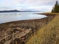
| 11/08/2005 05:48:35 PM | How precious and delicate is our world!by sednaComment: Greetings from the Critique Club!
This is a lovely shot, the lines leading you in, taking you around the shore.
As far as fitting the challenge, with the title it does, but what stands out as the most delicate part of the picture is the grass, the way it bends to the wind, so supple and small. I have a feeling you got hit on scoring for lack of impact on the overall shot and some probably felt it didn't really meet the challenge. Being a basic challenge you could have added a gaussian blur, adding to the delicate feel and maybe boosted the hue and saturation just a bit to really bring out the colors in the grass and the sky. If you decide to redo this shot with editing, I would love to see it.
Again, a beautiful overall shot and I hope my comments help.
Good luck in future challenges.
Deannda | | Photographer found comment helpful. |
| 11/03/2005 10:25:47 PM | ... noisy but fading ... United Nationsby tonyvComment: Greetings from the Critique Club!
Hello! What a powerful message in just the title alone and the picture really does go along with that message, the divirsity, the fade from light to dark, the shadows.
But you said yourself in your notes, it was not nice to add so much noise to this shot. The different colors and especially the greens do not respond very well to the noise and grain in this image. The front part of the shot almost looks blown out on the sialor's stomach area and the harsh shadows do not help this image. I would like to see it without the grain to see if it will make as much a difference as I think it might. Or even a little less grain.
Also, if the front or even second row was in better focus, if you used DOF to your advantage it might really make this shot stand out a bit more, that and a fill flash to help with all those shadows, they just are really distracting to me overall.
But again, powerful message with a potentially powerful image.
Good Luck in future CHallenges!
Deannda | | Photographer found comment helpful. |
| 11/03/2005 09:47:31 PM | Nakedby gwendyComment: Greetings from the Critique Club!
First I have to say, awwwwwwwwwwwwwwww! So cute! I love animal shots so I'm probably not the best person to critique this. But here goes.
First, great overall shot, really well done, the contrast just jumps out at you and catches your attention. Second, the addition of the grain really adds to this shot to a point, I think you could have gotten away with a bit more so it showed up on the bird itself. The lack of grain in that area probably hurt your overall score. That and the lack of black in the shot, I see the white and lots of grays but nothing really black to really make the shot pop.
The lighting is really well done and I like how the face seems to be in just a bit of a shadow, very nice. And the use of negative space on the right really works for me, I love these kinds of shots. A nice use of the rule of thirds though the upper left intersection doesn't land on anything in particular the lines run through the eyes and head drawing you in.
Overall, bravo!!!
Hope my comments help and Good luck in future Challenges!
Deannda | | Photographer found comment helpful. |
| 11/03/2005 12:57:20 AM | Autumn Grit and Autumn Gloryby ArtanComment: Greetings from the Critique Club!
Hello! This is a wonderful image and I love the colors and the composition and symetry (hope I spelled that right)
The lines that lead you in and out and in and out are just wonderful. But you said so yourself in the your notes, the lack of more grain, the large border are all things that will hurt a shot during a challenge, especially one that calls for grain. I had to really look at the shot to see the grain and knowing the average voter they didn't take the time to do that.
I personally would take this, clean it up and put it back up as a print or even leave it as it is and put it up for a print! ;)
Great shot! Good luck in future challenges!
Deannda | | Photographer found comment helpful. |
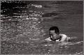
| 11/03/2005 12:53:30 AM | Silentby TiberiusComment: Greetings from the Critique Club!
This is a wonderful shot. I like the quiet look on his face. Me? I would have been panic city, but that's only because I can't swim, LOL!
The first thing that I notice about this shot is that it seems just a bit tilted to the left. Almost as if all the water is going to spill out that side and the poor man will fall out as well. It's a bit disconcernting (sp?). Maybe just the slightest tilt back to the right? The use of grain on this one is well done, not too much, not too little, just right!
The lack of contrast in this also makes it just rather sit there on the screen despite the motion of the water. It almost looks like a cross between a sepia tone and a black and white, like it can't quite decide and that is also a bit bothersome to me personally. I like one or other, I like both, but not at the same time, LOL :)
I hope my comments help!
Good Luck in future challenges!
Deannda
if you redo this I would love to see the results! | | Photographer found comment helpful. |
|
Showing 291 - 300 of ~1591 |
Home -
Challenges -
Community -
League -
Photos -
Cameras -
Lenses -
Learn -
Help -
Terms of Use -
Privacy -
Top ^
DPChallenge, and website content and design, Copyright © 2001-2025 Challenging Technologies, LLC.
All digital photo copyrights belong to the photographers and may not be used without permission.
Current Server Time: 04/22/2025 02:55:50 PM EDT.
|