|
|
|
Showing 321 - 330 of ~1591 |
| Image |
Comment |
| 09/17/2005 11:22:17 PM | A giant glow in space's darknessby PascalComment: Greetings from the Critique Club!
This is a wonderful idea for the High Contrast Challenge, nothing much blacker than space, right? :)
The cropping seems a bit loose, maybe if you had tightened it up more around the Nebula and then the other stars wouldn't be so distracting.
It's a great shot otherwise, not really much I could add or detract from the shot. Well done.
Deannda |  Photographer found comment helpful. Photographer found comment helpful. |
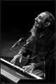
| 09/17/2005 11:11:20 PM | Feeling The Jazzby frumoazniculComment: Greetings from Critique Club!
From Romania! My sister-in-law is from Romania!
Anyway, this is a great shot! I love it! Had I the chance to vote I would have given it a 7 or 8. The overall composition, the motion on the hands, it's all great. But the high contrast is not really there for me. Some is there but nothing that really stands out against each other, lots of grays.
But again, a great shot otherwise.
Hope this helps.
Deannda | | Photographer found comment helpful. |
| 09/17/2005 11:05:02 PM | seed podsby U622Comment: Greetings from the Critique Club.
THis is a very interesting shot. The almost x-ray quality of it makes it interesting to look at and without the title would make one wonder just what it was.
The lighting on the left is a bit harsh and the post processing made it blow out, while offering a contrast to the black background doesn't really pull off as white as much as a really bright silver.
The grain would normally work with a shot like this but this one it ends up being more of a distraction to me in the end. I like the crop and the sizing, but maybe if it was smoothed out a bit, not so much texture. Hope my comments help.
Deannda | | Photographer found comment helpful. |
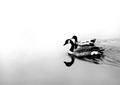
| 09/17/2005 10:31:16 PM | Complexity of natureby trainComment: Greetings from the Critique Club!
WOW! I love this shot, when I scroll up and down over the shot I get a really cool optical effect, LOL! :)
This is a wonderful high contrast shot but I'm betting it didn't do as well as you would have liked for a couple of reasons.
One, lack of focus, it seems soft or slightly out of focus. On a shot like this I like to see sharp, clear edges and lots of details.
Second, the cropping could be done just a bit differently. Maybe set it up so the petals on the bottom are just like the top, right out or in the corners. The colors are great, maybe just a bit over saturated but they do provide wonderful contrast.
I hope my comments help
Deannda | | Photographer found comment helpful. |
| 09/17/2005 10:21:11 PM | Heaven Is A Factoryby danderson107Comment: Greetings from the Critique Club!
What a beautiful shot! I love the clouds, the smoke stacks, it's very surreal.
The only thing I can see really wrong with this shot is the lack of a lot of contrast, at least high contrast. The contrast is there, just not very well defined to me. But the balance seems just a bit off, maybe a little tighter crop on the right to bring the stacks more in line. The capture of the puff of cloud on the left is fantastic!
Also, it just a bit too orange for my taste but that's me, maybe if it was touch more sepia brown?
Hope my comments help.
Deannda | | Photographer found comment helpful. |
| 09/17/2005 09:49:44 PM | Disturbing the Watersby kmbr2001Comment: Wow.
I love this shot! The simplicity, the contrast, the composition.
Oh, Greetings from the Critique Club! Sorry, the beauty of your shot distracted me from what I was here for. To critique your shot. This isn't going to be easy. The overall shot is fantastic, beautiful and well done. The contrast is perfect. About the only thing that would make this shot a 10 for me (would have been a 9 if I had time to vote) is a bit more clarity on the birds, they seem just a bit blurred or noisy, not sure which.
Otherwise, WELL DONE!!!
Deannda | | Photographer found comment helpful. |
| 09/17/2005 09:42:55 PM | Black and Whiteby hstegComment: Greetings from the Critique Club!
This is an interesting shot, you are right, Black and White, nothing more contrasting than that. :)
I like the idea, the fact that you colored it yourself and stayed inside the lines! I could never do that, LOL :)
The lines work well but the hand at the top is a bit much. You want the marker and the fingers but I used my magic envelope and cropped it just below the white area on the marker and it really brought the attention back to the black and white area. The lighting is a bit flat, maybe a slight adjustment on that to really make it pop?
Hope my comments help!
Deannda | | Photographer found comment helpful. |
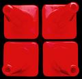
| 09/17/2005 09:32:51 PM | Four Conedby neophyteComment: Oooooo, look at the pretty colors! :)
Greetings from the Critique Club! I remember seeing this shot in the thumbnails, didn't get a chance to vote, but it did catch my eye in the quick review. I'm suprised this didn't score higher! The contrast is there without a doubt. I'm guessing the only problem I can really see with the shot is the lack of detail on the top two cones compared to the bottom two. The tops of the cones become blurred almost, you lose that circle that is so well defined in the lower cones. Also the lighting is a bit unbalance, there are more reflections on the top than the bottom, dealing with natural lighting can be so much fun sometimes, no? ;) Maybe if you could redo this with more balanced lighting to create equal reflections on all the cones.
Sorry I couldn't offer more suggestions but this is a very good shot and I would have given it an 8 or 9 if I had time to vote then. :)
But I love the optical illusion that it creates, you should consider setting this up for a print!
Deannda | | Photographer found comment helpful. |
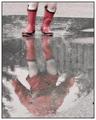
| 09/16/2005 10:57:10 AM | Splashy Reflectionby marmalade1121Comment: Looking at the montage you posted, if you had used the red version, oversaturated or not, I bet you would have had a top 10 finish! I love this shot but the muted colors probably hurt it in the overall scores. But a great capture and I'm glad to see I'm not the only mom who lets her kids play in puddles, did you teach her how to do it properly like I had to teach my oldest? :)
Great shot | | Photographer found comment helpful. |
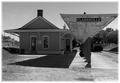
| 09/16/2005 10:51:56 AM | Shadows and Light (A Study in Black and White)by rayg544Comment: Greetings from the Critique Club!
This is a wonderful old time feeling shot of the train station. Though black and white is a nice choice for this, I always though sepia worked so much better for these types of shot, don't know why, just my preference I guess :)
I didn't get a chance to actually vote in this challenge, if I did, I probably would have given this a 5. It's a nice composition but the contrast is not really there. I see no real blacks or whites in the shot, mostly grays and it's very bright overall but nothing really stands out and pulls me into the shot. Also, it seems a tad off balance overall for some reason, maybe if you moved to the right just a bit and shot straight down the canopy area, making it look like one piller and having the piller on the right side line if you used the rule of thirds?
Also the finishing on the edge does nothing for me. It seems to take away from the shot more than add to it. Perhaps a solid white border on the outside to hold it all in, the fading effect in current use seems to suck more out than add in.
Overall, it's a very nice shot and I would love to see any reshoot or work you might try on this.
Hope my comments help!
Deannda | | Photographer found comment helpful. |
|
Showing 321 - 330 of ~1591 |
Home -
Challenges -
Community -
League -
Photos -
Cameras -
Lenses -
Learn -
Help -
Terms of Use -
Privacy -
Top ^
DPChallenge, and website content and design, Copyright © 2001-2025 Challenging Technologies, LLC.
All digital photo copyrights belong to the photographers and may not be used without permission.
Current Server Time: 04/22/2025 06:15:31 PM EDT.
|