| Image |
Comment |
| 04/13/2011 09:50:08 PM |
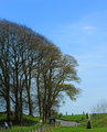
Grass & Sky At Avebury Stone Circleby SteveJComment: The use of a polarizing filter would make your greens more saturated, and the sky have more contrast. I like the vertical nature of this, but I think I would have cropped a little tighter to remove the family on the left. The road in the center could be an interesting leading line/path to follow. I think what this needs is something in the foreground, a point of interest that is more inviting and leads you into the vastness of the trees/sky.
--not participating. |
 Photographer found comment helpful. Photographer found comment helpful. |
| 04/13/2011 09:46:19 PM |
Flowers in Cool Moodby amnonComment: I don't mind the abstract nature, but I wish there was a little bit more sharp of a focus in this. The gradation in tone from left to right is really nice, I love some of the darker blues in there. There's a reflection (cabinet?entertainment center?) that is slightly rotated and is distracting (as it's a semi-recognizable object). Dig it, keep it up. |
| Photographer found comment helpful. |
| 04/13/2011 09:43:29 PM |
The Netby MArteSiComment: Quite an interesting architecture. Nice shadow and tone. I find the lovely blues and greens in the lower left hand corner to be MUCH more interesting than the mostly straight architectural elements. It fits the challenge, but I don't feel a huge connection with the photograph. I don't know what it is, but it's missing that one OOMPH that would push it up. I'll come back again before the challenge is over. --Not Participating |
| Photographer found comment helpful. |
| 04/13/2011 09:39:41 PM |
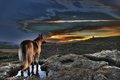
Cool with a little Warmthby AmmieComment: I find the HDR in this to be slightly distracting. If you follow the Shepard's eyes, it sends you into the land of evil red halo's. In terms of the challenge-cool colors, the foreground is quite mute, but when you go to the sky, the colors seem hyper-real, with the halo's creating shapes all of their own. ((I love how the dog found the only wet spot to stand in))Overall, It's not terrible, but it has some post processing that doesn't agree with my taste --Non-Participant |
| Photographer found comment helpful. |
| 04/03/2011 06:12:06 PM |
Budding Spheresby GeneralEComment: I really enjoy this, especially the more grainy bits. I agree with PennyStreet as well. |
| Photographer found comment helpful. |
| 03/30/2011 08:48:18 PM |
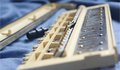
Disassembled Melodica by upturnedfaceComment: I don't see what the DOF is doing in this image. I feel like there should be a reason why that particular point is important and should be the focal point. I would have liked to have seen the black object on the left in focus instead, it draws more power to it because it's so much more different than everything else in the image.
It seems strange that this is on a wrinkled blue blanket.. I don't normally think of that when I think about music. I think it would have been fine if it didn't add wrinkles (added shadows/added meaning). |
| Photographer found comment helpful. |
| 03/30/2011 08:44:50 PM |
Screws uprisingby ionelpopComment: Screw leader, and his faithful screw followers.
I don't quite know what I'm looking at, I feel like it's automotive related. The quick change in DOF makes me feel like the top half of the image should be cropped. I want to look at the background, but it's not recognizable enough to be useful in interpreting it.
I think I would have desaturated the green channel a bit, it seems like such a weird color to have in a mostly dark/warmly lit scene. |
| Photographer found comment helpful. |
| 03/30/2011 08:36:38 PM |
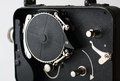
cine kodak eightby jgoingsComment: oooh, pretty.
Nice lighting, crop is good (more up top please, 20px more), texture is great to look at. Exposure is great. love the arrow and the implied sense of motion.
biggest gripe is that I don't necessarily feel "disassembled". It's kind of like taking the lid off a piece of tupperware and shooting the food inside.
anyway, 8/10. I'm sure you'll do well in this challenge. |
| Photographer found comment helpful. |
| 03/30/2011 08:33:46 PM |
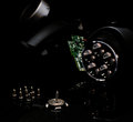
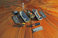
I don't know what this is...but I took it apartby ferrissComment: How dare you take apart an electromagnetic wobbler alarm coil, don't you know how rare those are?
This image feels a bit strange on a few levels. the floor is really distracting. it has some lines that lead you to the parts, but the parts are all at a strange angle to these lines. On top of that, the color of the floor is really overwhelming with the muted tones of the electronics. It's fighting heavily to be the focal point. This is further accentuated by the loose cropping on all the sides. You also get some strange reflections by keeping the cropping loose.
The shadows in this are really long and hard (thatswhatshesaid), and when combined with the dark grain of the wood, they kind of combine to draw you back into the background. |
| Photographer found comment helpful. |
| 03/30/2011 08:28:01 PM |
Johnny Five, No Longer Alive.by chazoeComment: I don't get the title reference.
My biggest qualm with this is that it's so close that I don't know that something is actually disassembled. With an exception to the lens, I feel like if I stuck my lens down a motherboard, it would have a similar look. It's a bit cramped, and crowded, and the lens isn't a very interesting focal point, although you did isolate it very well with the DOF. I wish there were some leading lines, or something to help me navigate around the image, at this point, I see an infocus lens, and some shiny metal, but there's not enough other things to stick around and enjoy. |
| Photographer found comment helpful. |
Home -
Challenges -
Community -
League -
Photos -
Cameras -
Lenses -
Learn -
Help -
Terms of Use -
Privacy -
Top ^
DPChallenge, and website content and design, Copyright © 2001-2025 Challenging Technologies, LLC.
All digital photo copyrights belong to the photographers and may not be used without permission.
Current Server Time: 04/21/2025 10:43:06 PM EDT.