| Image |
Comment |
| 03/30/2011 02:45:07 AM |
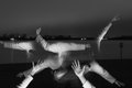
Apart from Myselfby icecold1980Comment: Love it ... with an exception to that weird sign on the right. I find the isolation of arms to be a good constraint. It needs one more pose, where you actually have your arms recede forward and backwards in space (image yourself standing sideways pointing at the lens) 6 |
 Photographer found comment helpful. Photographer found comment helpful. |
| 03/30/2011 02:42:13 AM |
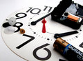
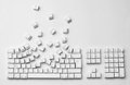
It Don't "Sing" to Me N'moreby bobkComment: On my monitor, it has some of the highlights blown out as well as the shadows. The numbers are a good leading line, to follow around the image. I wonder if those could have been used to more advantage. |
| Photographer found comment helpful. |
| 03/30/2011 02:40:34 AM |
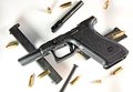
Shutter Speed Field Stripby strucky33Comment: seems a bit dark. I like the hierarchy of the objects. I'm not sure the reflections are helping in this case, they seem to make almost a double exposure effect on the pistol. |
| Photographer found comment helpful. |
| 03/30/2011 02:38:35 AM |
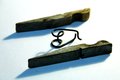
A little Pin Apart by gabileloComment: seems a bit soft. I think the coolest shadow is the center portion, and I'm sad that I don't get to see it. |
| Photographer found comment helpful. |
| 03/30/2011 02:37:58 AM |
Explosive Disarmamentby LydiaComment: good depth for a top-down image. highlights are a little bright for me. I love the hint of color in the shadows. 6 |
| Photographer found comment helpful. |
| 03/30/2011 02:36:54 AM |
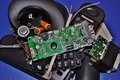
Communications Breakdownby supanovaComment: Good title. Wish the form was a bit more exciting, it seems a bit blobular (that's totally a word). The focus of this seems to be a bit too far back, I feel like the topmost object (either the gray connection, or the blue transistor) should be more in focus. |
| Photographer found comment helpful. |
| 03/30/2011 02:35:06 AM |
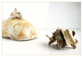
The Raging Bull & The Wise Manby ShubhiComment: Took me a little while to figure out the materials. I love love love the diagonal shadow on the back wall. The highlight on the skull bothers me, but not enough to really sway me. 7 |
| Photographer found comment helpful. |
| 03/30/2011 02:33:08 AM |
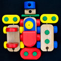
anagrammatized toyby gattamartaComment: The tight crop works well. What if you were to try cropping more out of the frame, and positioning it on a 30-45 degree angle? I dunno. I see this as a fun shot. If we were allowed triptychs, I could see this winning hands down.
Exposure is great, the bottom right corner bothers me a bit, (hair and seems too light) but the rest is nice. |
| Photographer found comment helpful. |
| 03/30/2011 02:27:28 AM |
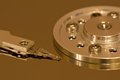
Hard drive reflection.by Bill666Comment: Good technicals, but it seems a bit default. The warm light strikes me as odd. I think of cool Light when it comes to electronics. Good textures in this for such a smooth surface. |
| Photographer found comment helpful. |
| 03/30/2011 02:26:01 AM |
Breakout by DistantColoursComment: Good form, interesting interpretation. Things are a bit diagonal on the bottom, which seems weird. An inch more on the top would do well I think. 8 |
| Photographer found comment helpful. |
Home -
Challenges -
Community -
League -
Photos -
Cameras -
Lenses -
Learn -
Help -
Terms of Use -
Privacy -
Top ^
DPChallenge, and website content and design, Copyright © 2001-2025 Challenging Technologies, LLC.
All digital photo copyrights belong to the photographers and may not be used without permission.
Current Server Time: 04/22/2025 03:16:42 PM EDT.