|
|
|
Showing 111 - 120 of ~285 |
| Image |
Comment |
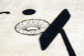
| 06/18/2006 04:25:51 AM | Shadow Ballby liltritterComment: I think this would be benefitted by an inclusion of something non-shadow to give it more depth |  Photographer found comment helpful. Photographer found comment helpful. |
| 06/18/2006 04:22:19 AM | | | Photographer found comment helpful. |
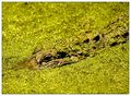
| 06/17/2006 03:49:23 PM | Don't Feed the Gatorsby ericwooComment: Composition
Like the eye being right on a third, and the gator leading across the frame diagonally.
Technical stuff (exposure, dof, lighting etc�)
Focus sharp, I think the dof is perfect, so the eye/face really stands out, and so that the water doesn't look icky.
Meeting the challenge
I'm one of those people to whom it appears more gold than green. Not enough that I'd think "dnmc" but enough that it doesn't leave an impression of "green-ness"to me, which I would expect from such a challenge.
Post-processing
Don't know what you did, and no real suggestions for improvements.
My personal opinion
Great shot, but doesnt scream green to me, even though it technically is (if that makes sense? see above). I love how the bg continues indefinitely, isolating the gator | | Photographer found comment helpful. |
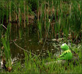
| 06/17/2006 03:36:56 PM | Maybe it is easy being green.by timfythetooComment: Composition
I like the placement of kermit in the frame, but maybe you could have found a simpler, less busy composition/pov to give it that extra something.
Technical stuff (exposure, dof, lighting etc�)
Seems a tad flat, as though available lighting was poor.
Meeting the challenge
Well duh :P
Other
Would prefer if the "fishing line" was taut, rather than floating in the water.
My personal opinion
Whilst you have some great shots of Kermit, it is quite worrying that half of your top 6 entries (I have 6 thumbs to view) feature him lol.
Great score anyway, well done | | Photographer found comment helpful. |
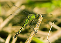
| 06/17/2006 02:59:55 PM | Dragons Fly?by tngrndreamComment: Composition
Fine for what it is. Another time you could maybe try some different angles, so that its more of a bugs-eye view but I understand there's an element of luck involved in "setting up" this kind of photo.
Technical stuff (exposure, dof, lighting etc�)
Focus is spot-on, but would like to see a touch less dof to get rid of that distracting twig. Very well exposed
Meeting the challenge
Well duh :P
Post-processing
Coped with the noise brilliatly. Had it been advanced editing I'd have toned down the b/g, either desaturate some (not completely though) or blur more, or both.
My personal opinion
Technically a very good shot, you should be pleased with it - shame it didn't score so high there's not really much to fault.
I do find the b/g detracts form the image as a whole, because the dragonfly doesn't pop out so much
Well done on getting another photo in your profile top 4 | | Photographer found comment helpful. |
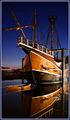
| 06/17/2006 02:23:32 PM | The Santa Maria Revisitedby timfythetooComment: Wow, congrats on the PB and 7+ with this great shot.
Slightly different format for Take Two...
Main critiques on original
brightness on right, more water reflection/detail, noisy sky, distracting bits (to be cropped out but you've just made them non-distracting)
What you've improved
Much better POV, without the teenagers to get in the way. Reflection really adds to it, and colours are more vibrant, without such noise.Because you've not had to crop in so tightly its compositionally much stronger. Also, maybe its just rfom the wider angle, but you've managed to avoid blowing out the brightest parts this time. Because the whole ship is in view, you've captured more of a sense of its grandeur, so it makes much more of an impact. Also, it avoids the clutteredness of the original.
Oh, and I much prefer this border, much neater imho.
What I prefer about the original
Whilst I love the reflection of the 2nd, I have to admit I prefer the position of where boat meets sea in the original - I think I'd like to see this one cropped to just below the porthole reflection
Overall, imho
Great work, you should be proud of it. Definitely deserved the score/placement, and its nice to see you do so well when I've seen the first photo and really can see the improvements. | | Photographer found comment helpful. |
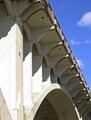
| 06/16/2006 06:40:00 AM | Rebridgedby MelethiaComment: Slightly different format for Take Two...
Main critiques on original
sharpening, better in B&W?
my own, due to lack of comments - maybe a touch too bright in bottom left
What you've improved
Much more life to it, more wow/creative element. More interest overall.
I love the effect of the gothic glow giving a real vibrance to the bg behind the bridge. The greens of the vegetation seem to shroud it, peeking out behind and from above. You've captured a sense of the place much more than was in your original, which was more an architectural study without giving context of the surroundings.
What I prefer about the original
More structured composition, lighting on the bridge was much more dynamic. Focus on the star, echoing the blue sky... you've kinda neglected the star in this retake, and changed focus, so its just a different perspective, not a bad thing.
Overall, imho
Lovely dreamy shot. I love the lighting (evening?) on the background, but would like a touch more lighting on the bridge (not sure if the two are reconcilable) | | Photographer found comment helpful. |
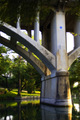
| 06/16/2006 06:32:22 AM | Texas Bridgeby MelethiaComment: Love the blue of the star and sky against the almost B&W of the bridge | | Photographer found comment helpful. |
| 06/16/2006 06:26:31 AM | Time of Death IIby nards656Comment: Slightly different format for Take Two...
First of all, I must be really inobservant 'cause I gotta admit, I didn't notice the gun in either entry for a long time.
Main critiques on original (from commenters)
too dark, focus issues, DOF
What you've improved
moving the gun from being a reflection to being behind the watch has helped with focus (although tbh I disagree with the orig commenters - I actually liked the OOF reflection because it was suggestive but took some thinking to realise it. Exposure overall is much better. Whilst the focus on the watch is better than in the original, you still suffer from a shallow dof and also seem to have focussed too high up the watch (focussing in the middle would disguise the shallow dof more).
What I prefer about the original
Whilst its a tad too dark, the black background really enhanced it, and you've lost that in the take two. Also, the tighter crop on the watch made it seem more oldfashioned, which I liked. (although I understand your lack of macro capabilities)
Overall, imho
Whilst you have tackled some of the technicalities of the original, I think you have sacrificed the mood of the original. Message edited by author 2006-06-16 06:26:56. | | Photographer found comment helpful. |
| 06/16/2006 06:08:18 AM | Dollhouseby LouisComment: Hi again, good to see you entering some more challenges.
This is very macabre, good atmosphere. I like how you can just see the walls, which gives a more empty-desolate feel rather than the more common empty-"I took everything out" effect. (if that makes sense?)
I like the combination of the composition and lighting to really focus on the corner and then draw the eye out into nothingness.
You definitely met the challenge, and succeeding in creating a very atmospheric photo. I looked up Lars Raun, and boy do I like his photographs. One of the things I like about his sinmilar photos (eg //www.photo.net/photodb/photo?photo_id=4275750) that you haven't particularly emulated is the "dirtyness", kind of old film grunge, which I think would really have improved this entry. | | Photographer found comment helpful. |
|
Showing 111 - 120 of ~285 |
Home -
Challenges -
Community -
League -
Photos -
Cameras -
Lenses -
Learn -
Help -
Terms of Use -
Privacy -
Top ^
DPChallenge, and website content and design, Copyright © 2001-2025 Challenging Technologies, LLC.
All digital photo copyrights belong to the photographers and may not be used without permission.
Current Server Time: 04/18/2025 09:50:40 PM EDT.
|