| Image |
Comment |
| 10/09/2005 01:29:52 AM |
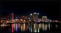
Visit anytimeby BradComment: sweet. I wish I could. that is a beautiful picture. I think I wish the boat wasn't there. I might be wrong. |
 Photographer found comment helpful. Photographer found comment helpful. |
| 10/09/2005 01:29:08 AM |
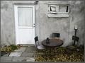
Shady Porch Swingby drydocComment: I wish I was there. I also wish you would have saturated better, not overexposed, used more contrast, and that the image was sharper in the foreground |
| Photographer found comment helpful. |
| 10/09/2005 01:27:32 AM |
My Cozy Cornerby gsalComment: oh, that is cute. Makes me wish I was there. I think a little more contrast would help. |
| Photographer found comment helpful. |
| 10/09/2005 01:23:47 AM |
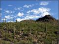
Topped with Saguarosby AzCKellyComment: on the right track here. you should use a polarizing filter witht this image, and your horizon is too centered. If it were more to the top or bottom it would have been a much more dynamic shot. You can still fix this in the crop. Also, more sat and a little bit of curves would have made this a perfect image. |
| Photographer found comment helpful. |
| 09/21/2005 12:03:34 PM |
As Fragile As...by RgarciaComment: great concept!!! if you would have used better lighting, this would have ribboned. |
| Photographer found comment helpful. |
| 09/18/2005 12:36:19 PM |
A Budding Judicial Branchby reeldeal4Comment: Greetings from the critique club.
This photo is a good example of thinking outside of the box a little. I know in the branch challenge a vast majority of the pics were actual tree branches. I like that this is different but not stretching the intent of the challenge.
Exposure. This seems to be spot on. I know that the reflection of the sun is blown out, and I don't mind that because it brings out the intensity of the sun.
Composition. I feel like this is where this photo could have been improved the most. When shooting architecture it is often difficult to find an angle that is unique and dynamic. My first suggestion would be to follow the rule of thirds a little more rigidly. This is almost a straight on shot. I think the building would look better if you were at a more dramatic angle from the front. I usually shoot at about 45 degrees. Also, that tree to the left is distracting. There is not enough of it there to actually be a part of the compostition, but it is still there. Perhaps if you took 10 steps to the left the building would have looked more 3 dimensional and you would have been able to include the tree in more of the composition (rule of thirds) This would also help your diagonals. Notice the top edge of the building is a slight diagonal. Further to the left and that diagonal would draw your eye around the image.
Post processing. I love the black and white treatment you have done on this image. Your blacks are black and whites are white. Not too much in the ugly middle range. You have done well. You have a very good grasp on how to make a black and white image. |
| Photographer found comment helpful. |
| 08/31/2005 10:34:34 AM |
|
| Photographer found comment helpful. |
| 08/31/2005 10:33:54 AM |
|
| Photographer found comment helpful. |
| 08/31/2005 10:27:50 AM |
|
| Photographer found comment helpful. |
| 08/31/2005 10:26:42 AM |
|
| Photographer found comment helpful. |
Home -
Challenges -
Community -
League -
Photos -
Cameras -
Lenses -
Learn -
Help -
Terms of Use -
Privacy -
Top ^
DPChallenge, and website content and design, Copyright © 2001-2025 Challenging Technologies, LLC.
All digital photo copyrights belong to the photographers and may not be used without permission.
Current Server Time: 04/02/2025 02:43:09 AM EDT.