| Image |
Comment |
| 01/28/2005 12:13:01 AM |
Prongedby KonadorComment: Nice minimalism... but golly is that an ugly fork! |
 Photographer found comment helpful. Photographer found comment helpful. |
| 01/28/2005 12:12:35 AM |
Trioby mattrixComment: Great colors... not sure the horizon helps, though. |
| Photographer found comment helpful. |
| 01/28/2005 12:09:13 AM |
Happy 3 DPC!by mrorange002Comment: Seeing the title of this image, I realize that that must be the very reason for this challenge! |
| Photographer found comment helpful. |
| 01/28/2005 12:08:45 AM |
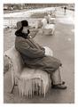
3 guys 3 zingby jjbeguinComment: I like the way the three figures lead the eye back into the photo.
Those benches are unbelievable! Here in California that sort of thing is utterly unheard of. |
| Photographer found comment helpful. |
| 01/28/2005 12:06:52 AM |
Mumbles Headby cheekymunkyComment: Great colors and minimalism. If I were you I might have experimented with cloning out some of the structures... I feel like some are good but all of them are too many. Also, lots of JPEG artifacts in the sky- I suggest NeatImage! (And it's free!) |
| Photographer found comment helpful. |
| 01/28/2005 12:04:33 AM |
Three Shellsby PoobaComment: Great colors. Two suggestions: (1) try a softer light source to avoid glaring bright spots. (2) notice where all the lines point... down and out of the image. it might have worked better to have the three points converging somewhere in the middle parts of the image. |
| Photographer found comment helpful. |
| 01/25/2005 02:35:43 AM |
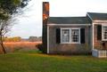
Cottage by the Winter Marsh — Herring Riverby Bear_MusicComment: Here's my input.
I gave this a 7. I will get around to saying just why shortly. I think it's a great picture, and its subtlety of tones set it apart from many of the other submissions. The curvature of the tree on the left holds the image together very nicely. In another challenge, say, a free study, I would probably have given this another point or two.
But the reason I didn't- and the reason I think that a lot of other people scored it so poorly- is that it's really not a shot of architecture. It's a shot that, technically, includes architecture, but the cottage doesn't appear to have anything particularly impressive about its design, nor is the cottage itself even the dominant element in the picture. What I most notice, in order, are the window, the chimney, and the golden light on the grass in the background. Following that I find myself looking at the image as a whole, and noticing the play of light and the understated gradations of tone. By my reckoning, it simply doesn't meet the challenge very well.
Which is not to say it's not a great picture- it is, to which your several sales attest. |
| Photographer found comment helpful. |
| 01/24/2005 05:04:41 AM |
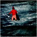
The Man From Snowy Riverby sabphotoComment: Greetings from the Critique Club!
There is a clear link between the picture and the title, which is always a good thing; you have definitely met the challenge. I wouldn't consider myself a movie buff, but I have seen probably more than the average number of movies, and I haven't heard of this one. Generally the entries that did well in this challenge used movies that are contemporary and fairly well known, so I think that worked against you here.
You did a good job of not blowing out any of the snow, which can be tough to do while still exposing the rest of the image well. I see that you used a very low ISO, which probably helped with that. However, the lighting looks very flat- it looks like the day was overcast. It might have been better to do this image at a higher ISO (and therefore higher contrast- a bit of grain would probably be an acceptable tradeoff for better depth in lighting) or at a time with less of a cloud cover.
It is generally good to follow the rule of thirds (if you're not familiar with this, I think there is a tutorial about it on this site). The subject of your photo is rather far to the left, which creates tension with the border and makes the composition feel lopsided. It would have been preferable to have him further into the frame, with a more comfortable distance from the edges of the image.
That will do for now. Just keep taking pictures :) |
| Photographer found comment helpful. |
| 01/24/2005 12:55:28 AM |
|
| Photographer found comment helpful. |
| 01/23/2005 09:40:50 PM |
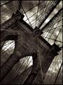
Brooklyn Bridge by JPRComment: Since I couldn't possibly imagine making this image better, I'm giving it a 10 and fully expecting it to win a ribbon. |
| Photographer found comment helpful. |
Home -
Challenges -
Community -
League -
Photos -
Cameras -
Lenses -
Learn -
Help -
Terms of Use -
Privacy -
Top ^
DPChallenge, and website content and design, Copyright © 2001-2025 Challenging Technologies, LLC.
All digital photo copyrights belong to the photographers and may not be used without permission.
Current Server Time: 04/19/2025 12:40:18 AM EDT.