| Image |
Comment |
| 04/17/2015 11:42:26 AM |
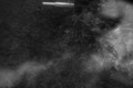
and then flowers and butterflies, like icing on a cakeby jmritzComment: This is just a hard picture to judge. The exposure just seems off to me. I can't tell what this is suppose to be. I can barely make out that it is a wheel barrel.
I would reshoot this, and either chimp or pay very close attention to the light meter after asking: what is my subject? What am I trying to show about that subject? |
 Photographer found comment helpful. Photographer found comment helpful. |
| 04/17/2015 11:39:02 AM |
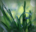
Can't See The Lawn For The Grassby jomariComment: What I like:
- Beautiful bokeh
What I don't like:
- Looks more like a lens test than anything else
- Focus really isn't strong on anything (which I think may have been the point...)
Overall: would make a nice desktop wallpaper as it is a soothing shot with nothing that would really distract focus. |
| Photographer found comment helpful. |
| 04/17/2015 11:35:09 AM |
Local Area Wireless Networkby herfotomanComment: What I like:
- It's a cute take on the subject
- The monotone broken up by the green light
What I don't like:
- It's a blah subject for me. If I didn't know the assignment- it would lose it's cute factor. |
| Photographer found comment helpful. |
| 04/17/2015 11:33:24 AM |
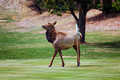
Manicured by volunteer, John Deerby hahn23Comment: What I like:
- That pose! I died! That deer has pizazz
What I don't like:
- The unfortunate placement of the flag pole.
- Subject is in center of frame. I think it would have been more dynamic if off set a bit.
Overall:
- Love the subject. Hate the flag pole. But that pose! Gah! I'm torn. |
| Photographer found comment helpful. |
| 04/17/2015 11:30:54 AM |
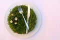
Al fresco dining by P-A-U-LComment: What I like:
- It's quirky, made me smile
- The lighting is great
What I don't like:
- I feel like this is trying to convey some message- but I can't figure out what it is.
Overall: I would hang this on my wall- I'm okay with not knowing what it is trying to say: great conversation starter. |
| Photographer found comment helpful. |
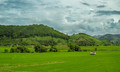
| 04/17/2015 11:29:08 AM |
Greener than greenby CocoCocoComment: What I like:
- Vibrant colors.
What I don't like:
- The horizon is in the center of the frame- making for competing subjects
Overall:
- I'm not a big landscape person, so take this review with a grain of salt. But I find the sky more dynamic and interesting than the land and wish the camera had been pointed a bit more up. That, of course, would lesson the adherence to the theme. With the lines formed from the grass running up the building- I wonder if this would have been a bit more dynamic (for the land) if the photographer had turned more towards 2 o'clock- allowing the lines in the grass to flow towards the building more directly- and chop out more of the sky. |
| Photographer found comment helpful. |
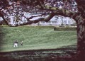
| 04/17/2015 11:23:45 AM |
Runby PaulComment: What I like:
- The movement of the children contrasting against the stillness of the tree.
- The framing of the children by the tree branch
- Composure is awesome!
What I don't like:
- Children are out of focus
- Pretty much everything is out of focus, giving the shot more the appearance of a painting than a photograph. Some may like this effect, I don not.
- Girl's clothing is burnt out. Can't really see the pink flowers- if the balance was better on this pic, those flowers would really pop making the framing even better. If the tree branches were made selectively brighter, it would burn out the distracting building in the background. I'd have tried to take a second picture after the children ran by and exposed for the tree. (I, however, have no idea how to do this- I'm more a darkroom editor and I would have selectively exposed the tree longer than the kids.)
Overall: Great idea, but lack of focus for the children takes away from overall mood. |
| Photographer found comment helpful. |
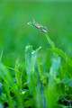
| 04/17/2015 11:16:33 AM |
The Overseerby JudiComment: What I like:
- It's quirky
- That bug has style. Awesome subject
- Great bokeh
What I don't like:
- Bug is a bit small in overall frame. I found myself leaning closer to my screen to try to make out more detail.
Overall: Love the subject, wish it was in better focus and took up more of the frame. |
| Photographer found comment helpful. |
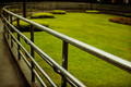
| 04/17/2015 11:13:10 AM |
Refreshingby GeorgesBogaertComment: What I like:
- The lines
What I don't like:
- The grass is not the subject, but rather the fence. So while I really like this picture of the fence (especially how depth of field was used to make it fade and become less distinct/ appear to have less containing force) it doesn't really scream "lawn" to me.
Overall:
Neat shot, but didn't capture the assignment for me. |
| Photographer found comment helpful. |
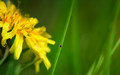
| 04/17/2015 11:10:14 AM |
Life in the Lawnby vawendyComment: What I like:
- the colors are vibrant
- great job finding that tiny tic!
- the lines
- the boka is very lovely
- competing but complementing sujects of flower and bug
What I don't like:
- depth of field is a bit too shallow for this subject matter- can't see enough of the flower
Overall: lack of focus distracts from having a strong subject |
| Photographer found comment helpful. |
Home -
Challenges -
Community -
League -
Photos -
Cameras -
Lenses -
Learn -
Help -
Terms of Use -
Privacy -
Top ^
DPChallenge, and website content and design, Copyright © 2001-2025 Challenging Technologies, LLC.
All digital photo copyrights belong to the photographers and may not be used without permission.
Current Server Time: 03/10/2025 06:23:46 PM EDT.