| Image |
Comment |
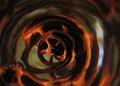
| 04/07/2004 08:28:31 PM |
Real Wheel Reflectionsby sfaliceComment: I love this shot! I would have tried a different composition, but as visual effect, I love it. I think I would have tried to have the wheel a bit blurred, so not entirely sharp... the contrast between the sharpness of the wheel and the fantasy of its reflection is a quite high... nevertheless GOOD job! |
 Photographer found comment helpful. Photographer found comment helpful. |
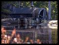
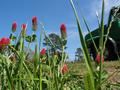
| 04/07/2004 08:15:36 PM |
Wood Wheel And Sun Wheelby MonaComment: WOW! A very very beautiful subject!
I would have preferred a closer shot... and not the reddish thing in front view... it kind of obstructs my view which longs to go to the house in the background... |
| Photographer found comment helpful. |
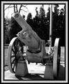
| 04/07/2004 08:12:40 PM |
US War Cannon, Pontiac Michiganby TikicharmComment: the challenge theme is the wheels so this shot must have been a profile shot... but try to make the wheels the subject and not the entire cannon.
it's also a bit blurred |
| Photographer found comment helpful. |
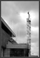
| 04/07/2004 07:55:36 PM |
|
| Photographer found comment helpful. |
| 04/07/2004 07:54:51 PM |
Highwayby davidbedardComment: this has a good potential , and what i imagine it would have fitted perfectly here would be an old carriage wheel; unfortunately the car was moving, so one can barely see the wheel; nice colours, but... |
| Photographer found comment helpful. |
| 04/04/2004 08:56:30 PM |
On the beachby AlexysComment: Visually, it's an enchantment! I love it!
But I am not sure... if it fits the challenge since it looks like the apple was put there, and not that it ended there by chance. |
| Photographer found comment helpful. |
| 04/04/2004 08:53:22 PM |
Stairway to heavenby gstrotmannComment: Nice shot! I would have named it "Out... of (its) place" because the title does not help it at all.
It has a nice look! |
| Photographer found comment helpful. |
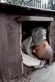
| 04/04/2004 08:09:12 PM |
Kicked outby moviemanComment: I am not sure if the title is really appropriate...
It's a clear shot, but... I can't exactly say that I like the composition, nevertheless it is kind of motivated by the situation... you cannot make a very well balanced composition when treating a subject like this... i still would have tried a different approach on the subject....
anyway, nice job! |
| Photographer found comment helpful. |
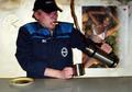
| 04/04/2004 05:44:00 PM |
Worker´s coffee breakby asijComment: not clear enough
ok, so i see the coffee going up instead of in the cup...but it's very difficult to see this, my attention was drawn upon the poster... and I am sure 99% of men would see that and no coffee...
there is no hint, only the worker's look
but there is not enough light in it
funny "personal" snap shot, but i am afraid, nothing more than that
|
| Photographer found comment helpful. |
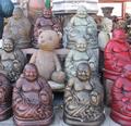
| 04/03/2004 08:11:46 PM |
Out of Place (I suppose)by MadMan2kComment: it is out of place indeed, but it blends in too much due to its colour... the eye is caught mainly by the red statues... |
| Photographer found comment helpful. |
Home -
Challenges -
Community -
League -
Photos -
Cameras -
Lenses -
Learn -
Help -
Terms of Use -
Privacy -
Top ^
DPChallenge, and website content and design, Copyright © 2001-2025 Challenging Technologies, LLC.
All digital photo copyrights belong to the photographers and may not be used without permission.
Current Server Time: 04/19/2025 06:13:33 AM EDT.