DPChallenge: A Digital Photography Contest You are not logged in. (log in or register
 
Browse Settings
Currently viewing:
Registered Usertristalisk

Show comments:

Per page:

Order:

Comments:


Comments Made by tristalisk
Pages:   ... ... [66]
Showing 201 - 210 of ~658
Image Comment
Find the 'A'
04/11/2005 02:11:57 PM
Find the 'A'
by MihaiCiobanu

Comment:
I don't want to find it.. Thats your job in this challenge.. Just show it too me... Just kidding.. great shot.. Great capture at just the right moment to get the shot. But it did take me a moment to find the birds letter. Nice job
Photographer found comment helpful.
iiiiii's
04/11/2005 02:07:10 PM
iiiiii's
by byoung

Comment:
Wonderfull shot... Just dosn't seem accidental to me.. otherwise i would have clicked on the 8 without hesitation.. as is ... dosn't it the challenge but still an awsome photo ... so 6
Photographer found comment helpful.
Iron Q
04/11/2005 02:04:56 PM
Iron Q
by lastef

Comment:
The shadow killed most of your Q it looks more like a G now.. Otherwise well done shot. I especialy love the color and details in the rust..
Photographer found comment helpful.
Computers are the Future
04/11/2005 12:58:43 PM
Computers are the Future
by lilwonka816

Comment:
Greetings From The Critique Club!!

Initial impact: Very unusual.. Definately outside the box!!

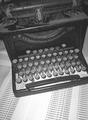
Meeting the challenge: Yes this fits the challenge very well. The typewritter was definately the beginning of an era. I love the one that you used for this particular challenge very old and rustic great find and idea.

Color: Well I bet you figured we couldn't hassle you any for color on this one... but alas here I am. I think that black and white worked bery well for this shot. it adds to the asthetic age of the photo. I'm not sure on this one but I think that sepia would have looked a little better. This also would have kept the old feeling you were trying to emulate.

Focus: The image is very grainy most noticably in the high detail areas. This is not a bad thing in this photograph. I just don't think it was done quite right. I think a more uniform grainlook would have given it more of an authintic grain. As is it looks like it was just a poor shot or bad file compression. (wich may be the case). I can't say for sure the grain was even necessary. While it adds a feeling to the photo DPC voter tend to hammer any one who shows any sign of it.

Lighting: The lighting is good but I think you probably could have gone a little further with it. I think some dramatic lighting would have helped your score a bit. Perhaps a spotlight from above in a dark room or somthing of the type.

Overall: I feel that two things hurt your score in the end. 1: the grain and 2: Lack of flash. While technicaly sound the photo does not posses much of a wow factor. No fancy mood lighting, no insane details, no dramitc shadows. It is textbook work. Simple straight to the point but devoid of emotional empact. I gave it a 7 while voting. I felt that it fit the challenge, was technicaly sound (I assumed the grain as intentional). It was one of my higher votes, but not quite 9 or 10 quality forme. Overall a pretty good image. Keep up the good work. I look forward to seeing what you come up with next.
Photographer found comment helpful.
pre-run stretch
04/08/2005 01:56:56 PM
pre-run stretch
by petrakka

Comment:
I missed the letter.. But I might just be blind
Photographer found comment helpful.
"T". . . for Tears
04/08/2005 01:50:59 PM
"T". . . for Tears
by miriam_mrb

Comment:
wonderfull shot.. I just feel your T is a little too subtle for this challenge. I little more light on it would help. Nice job
Photographer found comment helpful.
Sea Shell ME
04/08/2005 10:02:51 AM
Sea Shell ME
by Stagolee

Comment:
wow fun shot to look at great contrast and colors. Very interesting photo and fits the challenge perfectly. One of my top picks of the challenge...photo and title have a very spiritual feel. I don't usualy bother trying to guess the artist but thisjust sceams bearmusic to me.. Great job. 10
Photographer found comment helpful.
Freakey
04/08/2005 09:53:42 AM
Freakey
by mrmorris

Comment:
great shot but it's just a bit to dark for those of us voting on crappy work PC's. Fits the challenge perfectly, fun angle, and perfect focus.. just a bit to dark.. Nice job 7
Photographer found comment helpful.
All You Need
04/08/2005 09:51:42 AM
All You Need
by outland

Comment:
Took me a second..Love...great shot.. Wonderfull colors, perfect composition, lighting could use a little work.. But this does not feel accedental to me... good shot but does not fit the challenge IMO.
Photographer found comment helpful.
X-Factor
04/08/2005 09:49:50 AM
X-Factor
by biggood53

Comment:
Ok this fits the challenge. I don't find it to be a very interesting shot however. It is crisp and in focus. While technicaly it ok it just lacks an interesting enough subject to keep the viewer interested.
Photographer found comment helpful.
Pages:   ... ... [66]
Showing 201 - 210 of ~658


Home - Challenges - Community - League - Photos - Cameras - Lenses - Learn - Help - Terms of Use - Privacy - Top ^
DPChallenge, and website content and design, Copyright © 2001-2025 Challenging Technologies, LLC.
All digital photo copyrights belong to the photographers and may not be used without permission.
Current Server Time: 04/21/2025 06:24:00 AM EDT.