| Image |
Comment |
| 01/20/2003 09:01:54 AM |
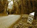
Highway 314by vjozComment: I love the shot, but the lights disctract. I'm also not sure about the yellow tint to it all too. |
 Photographer found comment helpful. Photographer found comment helpful. |
| 01/20/2003 08:56:19 AM |
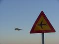
Roadsign?by jonrComment: Fun! The colors on the sign could be a bit brighter. |
| Photographer found comment helpful. |
| 01/20/2003 08:55:55 AM |
|
| Photographer found comment helpful. |
| 01/20/2003 08:55:22 AM |
|
| Photographer found comment helpful. |
| 01/20/2003 08:54:35 AM |
Sweet Inspirationby CubComment: Lovely shot w/ excellent color and focus. Too bad about the electrical lines. |
| Photographer found comment helpful. |
| 01/20/2003 08:52:36 AM |
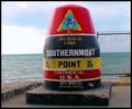
Are We Nearly There Yet?by ioComment: I like the photograph very much -- great placement of the marker -- but I'm not sure about the gold overtones. I think a more subtle sepia would have been better. |
| Photographer found comment helpful. |
| 01/17/2003 01:19:27 PM |
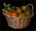
Yes, we have no bananasby DezComment: CRITIQUE CLUB!
Hi Dez. Contrary to what a lot of people have said in your comments, I do know this song and I think it's a great topic for the challenge. Too bad it was an obscure reference.
As for the picture, here's what I like: The lines of the basket are well-defined, and the focus is excellent. The background is also undetectable, which is very good.
Suggestions:
Compositionally the photo is lacking. There is too much of the basket showing, as the fruit is really the focus of the picture. Also, adding some fruits with more distinct colors (red apples and green apples instead of the ones you've got) would make the colors more vibrant and help them pop out from the dark background. I would maybe have tried to shoot this from a higher angle so that you can see the basket somewhat, but the fruit becomes the focus of the photo.
Lighting is quite dark. Part of this is due to the muddled colors of the fruits you've chosen, but it still could be brighter. If you have Photoshop or Photoshop Elements, try adjusting the levels upward. I took the liberty of adjusting the levels to show you what a difference it can make: //www.relliott.net/10577.jpg . (Side note: using a solid colored background will allow you to have stronger lighting without trying to wash it out so much.) (Side note #2: If you don't have Photoshop, search on the web for THE GIMP, which is a free alternative and is rumored to be pretty good.) The levels on this new image are 0,1.39,175. I'm not saying this is a better image (it's not), but this was done to illustrate how adjusting the levels can bring out the nuances in a photo.
You could also try diffusing your main light source (I just use a few sheets of typing paper over my lamp -- don't set it on fire, though LOL) to eliminate the hotspots on the fruit. Lighting from above would allow the fruit to be even brighter as well.
Good luck. Rob
"We have no bananas today...." |
| Photographer found comment helpful. |
| 01/14/2003 10:22:23 PM |
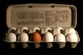
An Imposter!by smellyfish1002Comment: CRITIQUE CLUB!
Fantastic shot -- excellent idea for the challenge.
I like the way the background disappears. I also like the carton and don't mind the text -- makes it look like someone just opened it up and got a surprise.
The lighting from the right is a bit harsh. I don't mind it on the eggs so much, but the stark shadows it casts detract from the picture. Perhaps another light from the left and less light on the right would balance it out.
My only other suggestion is that maybe you could have shot this at a bit of an angle, just to make the composition of the photo more interesting. You could still show all 12 eggs, but just maybe from a 45 degree angle or so to give a little depth to the photo.
Overall, excellent. You met the challenge with a great photo. |
| Photographer found comment helpful. |
| 01/14/2003 01:46:53 PM |
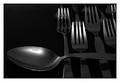
I am the Soup Forkby KonadorComment: CRITIQUE CLUB!
Yo, Ben.
Overall a very well-done photo. The range of blacks-and-whites is quite good and I don't think the photo is either too light OR too dark. The polaroid-y type border is well-done and sets the photo off from the page quite well.
I only have 2 nitpicks. The first is the flash of light in the cup of the spoon. Unfortunately, it draws the eye to it and distracts somewhat. If there had been a way to soften that, it might have been better.
Secondly, I'm not sure about the composition. I like the way the forks are lined up so rigidly, but having the spoon draped across them makes it seem like just a random spoon thrown into the shot -- not like the spoon was sneaking in to the lineup when it wasn't supposed to be there. I don't know what your intent for this was, but I'm wondering if it would have been more effective to have the spoon stuck in a row of similiarly-placed forks instead? Wonder if you tried that, or were just going for something different.
Either way, a great shot for the challenge.
Rob |
| Photographer found comment helpful. |
| 01/14/2003 01:37:09 PM |
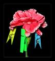
Colorsby JackoComment: CRITIQUE CLUB!
Personally, I'm not sure I get how this fits into the challenge, but I'm pretty liberal in interpreting challenges so I'll let it slide. :)
I greatly enjoy the vivid colors and detail in the flower. The lighting is well-done and the background is undetectable. I also think the way you did the border is EXCELLENT -- I really would't have thought of something like that myself, but am going to have to try it. Very interesting.
I only have two "suggestions" to add. First, the photo appears to me that it has been sharpened -- and perhaps a bit too much. Where the green clip is attached to the petal really seems...SHARP and I'm not sure that you want to draw that much attention to one portion of the photo like that. I'm not sure if that really makes sense to you, but I'd like to take a look at the original photo and see if it's a trick of my eye, or if it's a case of over post-processing.
The second suggestion -- and this is just a suggestion -- is that I would like to see the angle moved to the right very slightly so that the green clip is not in front of the stem of the flower. It seems weird, I know, but I wonder if it would make the flower look more like it's supporting the weight of all 3 clips with one little stem. Again, just an idea...don't know how it would work.
Overall, a very vibrant photo and one to be proud of. |
| Photographer found comment helpful. |
Home -
Challenges -
Community -
League -
Photos -
Cameras -
Lenses -
Learn -
Help -
Terms of Use -
Privacy -
Top ^
DPChallenge, and website content and design, Copyright © 2001-2025 Challenging Technologies, LLC.
All digital photo copyrights belong to the photographers and may not be used without permission.
Current Server Time: 04/11/2025 02:12:49 AM EDT.