| Image |
Comment |
| 07/24/2004 06:31:19 AM |
Artoisby UNCLEBROComment: I like this image. Its very stark. The swirls add a load of dynamics to the image. The lighting is good also. I would perhaps suggest it could have had a little more space all the way around just to help to give the swirls a little more room. |
 Photographer found comment helpful. Photographer found comment helpful. |
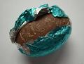
| 07/24/2004 06:20:57 AM |
Egg Messageby mtbriderComment: Wow, a punk easter egg. The lighting works well and the textures compliment each other. I don't think the central composition helps to enhance the message. The image is quite cute and I wonder if different cropping might have helped to make the image a bit more unique. More space on the top and the right may have made it look a little more "off centre" as it were. |
| Photographer found comment helpful. |
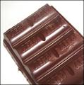
| 07/24/2004 06:15:31 AM |
The Chocolate Platterby NodeComment: The even lighting works well. The leaves around the top certainly enhance the image. This looks like a photograph from a restaurant menu, its well presented. |
| Photographer found comment helpful. |
| 07/24/2004 06:13:35 AM |
Aeroby thirteen_timesComment: I think the composition and cropping work well. Its a good idea. The lighting is a bit "hard' though. The white highlights tend to get the focus of attention. There's also a hair or something similar in the top left that detracts from the image. |
| Photographer found comment helpful. |
| 07/24/2004 06:10:13 AM |
Flake!by PixelstateComment: Great use of depth of field. The lighting works well too. The subject matter certainly gets pushed forward. Its a very stark image, no subtlety about it. |
| Photographer found comment helpful. |
| 07/24/2004 06:03:11 AM |
|
| Photographer found comment helpful. |
| 07/24/2004 06:01:43 AM |
|
| Photographer found comment helpful. |
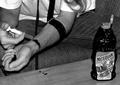
| 07/24/2004 05:57:42 AM |
Chocolate Junkieby BassieComment: The choice of black and white works really well. The subject is quite bizzare which is enhanced by the cartoon rabbit leering out of the corner of the picture. The lighting, contrast and textures are great. I wonder if the lighting was a bit more " low key" if it would push the "bizzare" angle a little further. |
| Photographer found comment helpful. |
| 07/24/2004 05:51:20 AM |
|
| Photographer found comment helpful. |
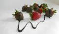
| 07/24/2004 05:49:45 AM |
Romanceby siggiComment: The colours and the lighting work really well. I love the red background. I think the image looks a touch crowded. There's alot going on. I think a little more open space would add to this image. |
| Photographer found comment helpful. |
Home -
Challenges -
Community -
League -
Photos -
Cameras -
Lenses -
Learn -
Help -
Terms of Use -
Privacy -
Top ^
DPChallenge, and website content and design, Copyright © 2001-2025 Challenging Technologies, LLC.
All digital photo copyrights belong to the photographers and may not be used without permission.
Current Server Time: 04/18/2025 05:09:34 PM EDT.