| Image |
Comment |
| 11/27/2005 01:45:50 PM |
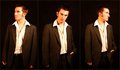
On the Catwalk (Re-processed)by alien2thisworldComment: The re-processing definately helps this image. Much better. The color cast is somewhat distracting, but a simple b/w conversion would easily fix the problem and have the added benefit of improving the image (IMHO). Overall this is an excellent concept and I really like the way you've arranged your poses. |
 Photographer found comment helpful. Photographer found comment helpful. |
| 11/27/2005 12:28:25 PM |
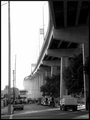
Side Streetby tpocComment: Nice use of leading lines and I really like the b/w choice you made. The image itself is a little busy and could probably use a little cropping off of the street clutter to bring more focus on the bridge. You could even get more punch out of it by cloning out the power lines and telephone poles. Overall, great shot! |
| Photographer found comment helpful. |
| 11/27/2005 11:39:07 AM |
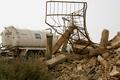
Only in IRAQ!by shaverComment: Very interesting shot and definately fits the challenge. I agree it would probably look a little better in black and white. For fun it would be interesting to see what it would look like with some added noise. I would also suggest cropping off a little on the right to make the fence(?) less centered. |
| Photographer found comment helpful. |
| 11/27/2005 11:25:18 AM |
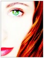
Self Portraitby MakkaComment: Great lighting. The image is pretty spooky with the selective desat which is what I assume you were going for. I really like the blue coloration to the eye, but somehow the lighting seems a tad offish on the eye. It seems just a hair too bright and artificial. Maybe just a hint of burning in would give it a more consistent look with the rest of the image. |
| Photographer found comment helpful. |
| 11/27/2005 11:20:29 AM |
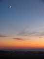
Twilight Moonby pacpintoComment: Good shot. I really like the "layered" appearance of the sky. The moon and star/planet(?) are very nice touches. The horizon is a bit hazy and low contrast which may be improved by a slight hue/saturation tweak. Overall a pretty good shot that could be improved with a little PS play. |
| Photographer found comment helpful. |
| 11/27/2005 11:05:15 AM |
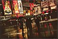
Times Square in the Rain (color)by pawdrixComment: At first glance I thought the contrast looked a little low (in the foreground), but after further examination, I don't think this image would work if the contrast was higher. I really like the tilted perspective and composition. Very urban... Very nice!!! |
| Photographer found comment helpful. |
| 11/23/2005 02:14:46 PM |
Helenby myceliumComment: Very interesting shot! I think I would like to see a little more cropped off of the right side. Is this a long exposure or a composite? I love the composition and focus. The color works very well also! |
| Photographer found comment helpful. |
| 11/23/2005 09:21:46 AM |
|
| Photographer found comment helpful. |
| 11/22/2005 02:47:01 PM |
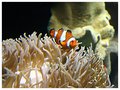
The Saddest Nemoby RikkiComment: Nice color, I would like to see a tighter crop and a little sharper focus. I'm a huge Nemo fan and I love the way you've captured him in his environment with the anemone! |
| Photographer found comment helpful. |
| 11/22/2005 02:45:14 PM |
Aeon IIby RikkiComment: Very nice, I like this one more than the first one. Very digital art! The light in the eye makes this one! |
| Photographer found comment helpful. |
Home -
Challenges -
Community -
League -
Photos -
Cameras -
Lenses -
Learn -
Help -
Terms of Use -
Privacy -
Top ^
DPChallenge, and website content and design, Copyright © 2001-2025 Challenging Technologies, LLC.
All digital photo copyrights belong to the photographers and may not be used without permission.
Current Server Time: 04/23/2025 06:39:27 AM EDT.