| Image |
Comment |
| 02/28/2007 12:36:58 AM |
|
 Photographer found comment helpful. Photographer found comment helpful. |
| 02/28/2007 12:36:10 AM |
Jenby kloecktComment: this looks like it had a great start, I don't like the photoshop work you have done here. maybe just a black and white would have done or even a color image. The noise just takes away from the impact of the overall image by taking the eye away from the overall image and taking it to the skin. |
| Photographer found comment helpful. |
| 02/09/2007 04:24:59 PM |
A Golden Afternoonby faeryComment: wow, what a great image. I love how the light is just right and the placement of the subject is very very nice. with that said the color seems a little off, I know your title iludes to the fact that this is done on purpose but I don't think dpc voters will see that. overall i really like this image though, looks like a still from a very good day of hikeing maybe. |
| Photographer found comment helpful. |
| 02/09/2007 04:21:37 PM |
Giving and Receivingby justamistereComment: this image is just a little off to me. the idea is nice I guess but the techincals just are not there. the hands are acward, especialy the one on the left. the rose is in focus and that is good, but the composition is not doing much of anything in he way of story telling, and the bottom of the left hand is cut off. the leaves on the rose look a little bug eaten and the outer pedals look roughed up as well. |
| Photographer found comment helpful. |
| 02/09/2007 04:14:53 PM |
looking good babe!!by super-daveComment: slective desat works from some image, though i don't think it does for this one. with that said though, you did a very nice job doing it. i like the compostion and the visual movement in the frame. i don't see a top 10 finish here but I don't think the image is all that hateful. |
| Photographer found comment helpful. |
| 02/09/2007 04:13:34 PM |
Good...For a Few Months Anywayby cassilda_terryComment: wow, what a cute face! I really like the expression, though I think it lacks some technicals. the lighting is really just flat, meaning there isn't much shadows created by your light source. I'm assuming you used on camera flash here and the catch lights in the baby's eyes are in the dead cener of the eye making it both flat and a little weird to look at.
again I love the expression though, and with kids that is more then half the battle. mabey use some light from a window next time and I think you will be in business. |
| Photographer found comment helpful. |
| 02/09/2007 04:09:22 PM |
Page Turnerby jimnessComment: not a bad idea, I really like the shot you were going for here. I do have some critque though, you have your subject lite from under the plane of his nose. when you do that it looks like the subject is sitting around a campfire. Your color is also very green, some color corecting would have been some major help to this image. Your midtones and shadows are also very flat, a curves adjustment may also be in order.
that said there are some good things about this image too, it's compostion is really nice and the expression cought is very well done too. |
| Photographer found comment helpful. |
| 02/06/2007 10:51:38 PM |
5 past 4by roby21112Comment: her face is a little out of focus, and the color isn't right |
| Photographer found comment helpful. |
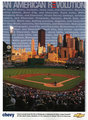
| 02/05/2007 03:33:13 PM |
Chevy Adby alanfreedComment: thats really a great image. how did you go about submiting this to chevy. I think I may have seen in in a magizine recently though I'm not 100% sure about that. |
| Photographer found comment helpful. |
| 02/05/2007 03:24:45 PM |
SMILEby JPRComment: :) I like it, color is bad I agree but It did make me smile! |
| Photographer found comment helpful. |
Home -
Challenges -
Community -
League -
Photos -
Cameras -
Lenses -
Learn -
Help -
Terms of Use -
Privacy -
Top ^
DPChallenge, and website content and design, Copyright © 2001-2025 Challenging Technologies, LLC.
All digital photo copyrights belong to the photographers and may not be used without permission.
Current Server Time: 04/19/2025 07:32:26 AM EDT.