| Image |
Comment |
| 02/09/2005 06:58:29 AM |
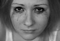
Painfull lifeby DogAngelComment: Could be sharper. If it wasn't for the make-up, the pain would be hardly visible. Maybe you could have included a reason for her pain in the picture. 5. |
 Photographer found comment helpful. Photographer found comment helpful. |
| 02/09/2005 06:57:24 AM |
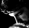
the passionby charliebakerComment: Nice composition and theme. I thought about this too, but rejected the idea. Your loghting is a bit harsh I think. The right half of the face is blown out. Perhaps you just used too much contrast. The grain is cool. 6. |
| Photographer found comment helpful. |
| 02/09/2005 06:54:15 AM |
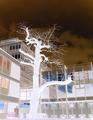
A Tree in PAINby tazzaComment: Why did you turn this negative? I think it would have been great in it's original colours, with a narrow DOF on the tree. It looks as if the tree was twisting it's branches in pain because some were cut off. The negative really ruins this for me. 4. |
| Photographer found comment helpful. |
| 02/09/2005 06:51:36 AM |
|
| Photographer found comment helpful. |
| 02/09/2005 06:50:30 AM |
Griefby sfboatrightComment: Oh, not another woody picture... hey wait, this one's godd, actually! I didn't know woodies could show emotions. Nice. Now, if only the second hand was inside the focus, the DOF would really add some athmosphere. Nice colour tone and lighting. 8. |
| Photographer found comment helpful. |
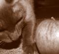
| 02/09/2005 05:03:26 AM |
Kitty Nose with Appelby charliebakerComment: You got me. I had a feeling this might be someone going for the brown but I wasn't sure, so I preferred giving tips to that poor photog who couldn't handle his/her camera. Ouch. |
| Photographer found comment helpful. |
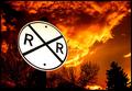
| 02/08/2005 04:57:00 PM |
The Flagrant Crossing by CutterComment: Cool colour and composition. The signs is a little too bright for my taste, but at least it really stands out against the baclground. On second thought, it's fine. 8.
Revisit. Bumping to 10. |
| Photographer found comment helpful. |
| 02/08/2005 04:56:15 PM |
|
| Photographer found comment helpful. |
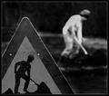
| 02/07/2005 05:37:02 PM |
Here's your signby HrutsenComment: Nice DOF. B&W was a good choice, it emphasizes the composition. The real man is a little blown out, but it doesn't bother me that much. 9. |
| Photographer found comment helpful. |
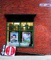
| 02/07/2005 05:35:52 PM |
Down'n'Out on Love Laneby kdkaboomComment: One of those pictures which I like very much without being able to tell why. Last time I had that problem with a picture it ribboned. Maybe the same will happen to you. I give you a 10. |
| Photographer found comment helpful. |
Home -
Challenges -
Community -
League -
Photos -
Cameras -
Lenses -
Learn -
Help -
Terms of Use -
Privacy -
Top ^
DPChallenge, and website content and design, Copyright © 2001-2025 Challenging Technologies, LLC.
All digital photo copyrights belong to the photographers and may not be used without permission.
Current Server Time: 04/23/2025 09:09:01 PM EDT.