DPChallenge: A Digital Photography Contest You are not logged in. (log in or register
 
Browse Settings
Currently viewing:
Registered Usereschelar

Show comments:

Per page:

Order:

Comments:


Comments Made by eschelar
Pages:   ... ... [127]
Showing 421 - 430 of ~1266
Image Comment
Trough The Storm
10/03/2007 12:39:59 AM
Trough The Storm
by ludde

Comment:
Wow. the strong complete desaturation in the sky and the road are excellent complements. The grain gives excellent effect as well, heightening the contrast between the surrealistic B&W elements and the idyllic colored elements which have a gentle touch of editing.

Very strong sense of depth. Good stuff!
Photographer found comment helpful.
Skagit River
10/03/2007 12:32:59 AM
Skagit River
by Agaricus

Comment:
gorgeous capture. The blues in this really stand out although I initially was drawn to the image by the lighting.

The 2nd border is very subtle and appears a bit more subtle on the right and bottom and additionally appears a bit uneven... I would not mind at all if it were only affecting the top and left edges.

Message edited by author 2007-10-03 00:34:38.
Photographer found comment helpful.
17, 35, and 85 mm focal lengths
10/03/2007 12:15:50 AM
17, 35, and 85 mm focal lengths
by HighNooner

Comment:
what a superb blending job!
Photographer found comment helpful.
Castle on the Hill
10/03/2007 12:02:58 AM
Castle on the Hill2nd Place
by KarenNfld

Comment:
What's black and white and RED all over? ;) gratz!
Photographer found comment helpful.
Picture 135 apple tarte.jpg
10/02/2007 11:47:27 PM
Picture 135 apple tarte.jpg
by pawdrix

Comment:
nice choice in surrounding objects. their colors and shapes lend well (specifically BG objects). That looks seriously tasty!
Photographer found comment helpful.
See It To Believe It--16 Months After Hurricane Katrina
10/02/2007 11:44:03 PM
See It To Believe It--16 Months After Hurricane Katrina
by Gallatin

Comment:
quite an interesting pic. I wonder how related the smashed up car is.

It's interesting that the CBS probably put more money into that billboard from tip to tail than it would have cost to take care of that building... not that that means anything at all...

Nice juxtaposition in the pic.
Photographer found comment helpful.
Self Portrait
10/02/2007 11:09:20 PM
Self Portrait
by posthumous

Comment:
lighting is flat and I hate the border... Oh, and the '80s called. they want their glasses back! ;)
Photographer found comment helpful.
Smokestack
10/02/2007 10:59:47 PM
Smokestack
by EstimatedEyes

Comment:
Interesting to read your comments about where you wanted this to go and then see where it went.

I see a couple of issues.

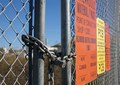
1 - crop - this affects a lot of things as this is a complex image.

Crop affects your horizon. Crop affects the position of the lock and its position in the viewing hierarchy. Crop affects the rhythm of the image, particularly when contrasting the close-up view of the wire-link fencing on the left and the pattern on the right.

2 - color - this affects the way we look at your message in the picture. The voters don't like much interpretation here, but I do. I personally would have tweaked the color a bit particularly in the sky to reduce the pure naturalness, possibly with some cues to the strongly colored signs. I might have experimented with a strong selective B&W with a yellow/orange or red filter to really get the sky fading to darkness to highlight the contrast with the smokestack too.

3 - subject management - you have a lot of subjects here. The lock, the smokestack, the fence and the signs. All of these play a role.

You were trying to relate the smokestack to the lock and chain, as well as build the impression of restriction from the signs as well as from the texture/opaqueness of the fence. From a composition POV, I would prefer to see the camera move in a couple of inches and up a bit. Perhaps just a hair to the right.

This would allow the lock and chain to 'frame' the smokestack using the asymmetrical V shape. You could have chosen to align the smokestack with the descending chain or with a part of the lock.

It is unfortunate that the scene seems so idyllic with no visible pollution coming from the smokestack as this really reduces it's visual role. Increasing contrast around the smokestack could take various forms.

Regarding the signs on the fence, it's not all bad. You seem to have a reasonable amount of use of 'vanishing point' to give depth to the signs, although it does feel that the right crop point needs to be moved in a bit to lessen their impact slightly.

If you want further demonstration of any of this, feel free to PM.
Photographer found comment helpful.
Dinner Party - SP7
09/29/2007 03:46:56 AM
Dinner Party - SP7
by alfresco

Comment:
aka - what to do with all this extra meat? :)
Photographer found comment helpful.
mannequin
09/28/2007 05:09:40 AM
mannequin
by lovethelight

Comment:
did you liquify her eyes? wow!
Photographer found comment helpful.
Pages:   ... ... [127]
Showing 421 - 430 of ~1266


Home - Challenges - Community - League - Photos - Cameras - Lenses - Learn - Help - Terms of Use - Privacy - Top ^
DPChallenge, and website content and design, Copyright © 2001-2025 Challenging Technologies, LLC.
All digital photo copyrights belong to the photographers and may not be used without permission.
Current Server Time: 04/21/2025 06:23:59 AM EDT.