| Image |
Comment |
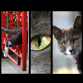
| 06/24/2007 09:56:28 AM |
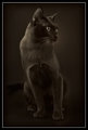
Portrait of a Catby BenComment: Nice pic! A TINY bit overzealous on the saturation on the reds and greens on the left and a very tiny bit soft on the segment to the right... also, could have done without the blurry blob in the foreground...
Still, an excellent pic in general. |
 Photographer found comment helpful. Photographer found comment helpful. |
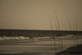
| 06/24/2007 09:28:59 AM |
untendedby SkipComment: Lookin good skip. I like that the fishing lines are visible... IMHO, could use a bit more contrast, particularly in the sand on the left and in the waves on the sea. maybe brightening the non-shadows in the sea might help.... darkening the waterlines in the sand...
and of course the horizon....
I can't help but wonder if there might be something nice added by putting a little bit of gradient in the sky... just a hint, something to complement the very slight vignette in the corners.
nice mood! |
| Photographer found comment helpful. |
| 06/22/2007 12:35:21 PM |
• First Night, 2007 • by Bear_MusicComment: *picks jaw up off the ground* wow. don't know what's more exceptional, the image or the amount of work you put into images. Wow. |
| Photographer found comment helpful. |
| 06/22/2007 08:16:32 AM |
Pure as the Rose, as the Enfolding Heartby Bear_MusicComment: I think the thickness of the border is appropriate, but I wonder if it might be a bit nicer with a softer color such as one sampled from a bit inwards from one of the edges. personal taste really. Great job as usual :) |
| Photographer found comment helpful. |
| 06/21/2007 02:30:16 AM |
|
| Photographer found comment helpful. |
| 06/21/2007 02:25:27 AM |
The Lookby mia67Comment: really nice. try a layer of overly strong neat image and mask it to apply it only to the background... will get rid of that nasty pixelating in the BG...
Another thing you might try is to use a layer of curves to boost the shadows to where you want them and use gradients at lowish opacity to get your light back... The lighting seems to be a mite haphazard in this shot.
Love the border! |
| Photographer found comment helpful. |
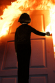
| 06/20/2007 09:42:26 PM |
Firestarterby SnakeComment: A couple of things I noticed:
#1 focus is good on the door. Soft on the child. This works perfectly for this shot... gives a bit of an 'off' feeling to the child. Being underexposed is quite normal and natural for the 'other side' of the light... This is not intended to be a beautifully lit portrait.
#2 the insertion of the child into the shot is very well done. Needs a tiny bit of a feather or something around the head on the right side... there's a bit of hue or something from the original pic left that gives a bit of 'cutout' look.
#3 a bit of a distraction in the top left quadrant in the flame, about a third of the way down near the edge... this is the only thing that gets you thinking about the background that would normally be around the door. Get rid of that and the illusion is complete.
All in all a truly excellent work! Message edited by author 2007-06-20 21:45:00. |
| Photographer found comment helpful. |
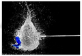
| 06/20/2007 02:52:50 AM |
Target Practiceby NstiG8trComment: I learned something by looking at this picture. Don't forget to light from behind... Very nicely done.
PS. What's the projectile? an arrow? a fishing speargun spear? Message edited by author 2007-06-20 02:53:23. |
| Photographer found comment helpful. |
| 06/19/2007 02:36:59 AM |
|
| Photographer found comment helpful. |
| 06/15/2007 07:55:22 AM |
|
| Photographer found comment helpful. |
Home -
Challenges -
Community -
League -
Photos -
Cameras -
Lenses -
Learn -
Help -
Terms of Use -
Privacy -
Top ^
DPChallenge, and website content and design, Copyright © 2001-2025 Challenging Technologies, LLC.
All digital photo copyrights belong to the photographers and may not be used without permission.
Current Server Time: 04/22/2025 12:21:18 PM EDT.