| Image |
Comment |
| 04/22/2005 01:37:00 PM |
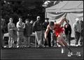
Focusby ZoomdakComment: Something looks weird with his right hand - did he have a baton? If he had, it should not have been desaturated IMO/ if he hadn't it looks like his hand is detached from the body.
Otherwise a good use of selective desaturation, as it makes the runner stand out whereas otherwise he would blend in with the background crowd. |
 Photographer found comment helpful. Photographer found comment helpful. |
| 04/22/2005 01:32:02 PM |
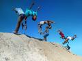
Care Free by JeanComment: I think that this is the winner. Excellent capture, great colors! Good DOF with all children pretty much in focus, at the same time crisp image done with fast shutter.
Technically superb, very nice composition, 10 from me. |
| Photographer found comment helpful. |
| 04/22/2005 01:29:32 PM |
Four Señoritas - Albuquerque NM Tricentennialby jemisonComment: They really look angry. Excellent capture. The outside shot done at or near the middle of the day though - sun casts unwanted shadows on people's faces. Not much could be done with basic editing though.
Good luck!
Edit: This is an advanced editing challenge. Still like the image though. |
| Photographer found comment helpful. |
| 04/22/2005 01:28:27 PM |
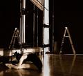
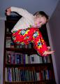
Perserveranceby LowLghtComment: I like the overall darker tone of the image, but I don't think I can find a good reason for the ladder in the picture. (both the actual one and the reflection in the mirror).
Even if the all was left was a negative space, it would have been better.
Still one of my top 10% picks for this challenge. |
| Photographer found comment helpful. |
| 04/22/2005 01:25:00 PM |
Windows to the soulby arpitaComment: Beautiful!
Improvement suggestions: image is too hot on the left side. I would not crop it though as the composition is perfect as it stands right now. Perhaps a slight curve adjustment would have helped.
Eyes - there is a light reflection in the retinas - something you could have tried to ameliorate by cloning or burning...
Still think that this will end up in top 10%. |
| Photographer found comment helpful. |
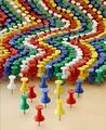
| 04/21/2005 01:20:02 PM |
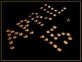
Tacks Dayby ShannonComment: Same standard idea, tacks/tax, 4/15, etc. but taken to the new, original level for this challenge. Excellent reflection and good execution. Currently in my top 10 images. |
| Photographer found comment helpful. |
| 04/21/2005 01:17:33 PM |
Tack Attackby GolferDDSComment: Wow! Some effort went into setting up this shot - and what a great DOF came with it. So simple yet so effective. Very nice. |
| Photographer found comment helpful. |
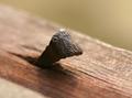
| 04/21/2005 01:09:07 PM |
Old Time Tackby MonaComment: A very interesting take on the challenge, and an excellent image with great DOF.
Critique: the lower left part has the lighter shade of wood or something else. I would have preferred to see it either cropped or cloned or both.
I also like the light reflection on the top of the tack, but it would have been interesting to see what it would look like with the light source coming from the front-left, illuminating more of the dark areas of the tack. I'm not sure if that would make the whole image better or not, but it would eliminate the shade in the front. |
| Photographer found comment helpful. |
| 04/13/2005 02:23:55 PM |
|
| Photographer found comment helpful. |
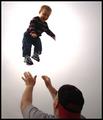
| 04/13/2005 02:22:24 PM |
Flight Simulatorby smoon273Comment: For some reason, that strong hot lighted area takes away from the kid's expression for me. I wish it didn't have those blown highlights.
ps. why validate? I do this with my kids all the time... |
| Photographer found comment helpful. |
Home -
Challenges -
Community -
League -
Photos -
Cameras -
Lenses -
Learn -
Help -
Terms of Use -
Privacy -
Top ^
DPChallenge, and website content and design, Copyright © 2001-2025 Challenging Technologies, LLC.
All digital photo copyrights belong to the photographers and may not be used without permission.
Current Server Time: 04/12/2025 12:28:24 PM EDT.